Most viewed logos – Page 492

A logo for a New Mexico spa located by therapeutic rivers


A idea for music studio


This concept is based around a simple typographical focus on the RSSA acronym. The Society’s diverse scientific interests helped to form this visual approach, ie deliberately avoiding reference to any particular field with a recognisable visual. The intention was to provide a current day sensibility regarding identity design and construction, in combination with more traditional styling for a long established scientific body. To aid this desire, a modern serif was chosen as the primary font and a secondary sans serif for the tagline versions. These fonts were chosen as a combination for their ability to convey this future/past feel. The icon structure has the added effect of allowing the reading of ‘RS’ & ‘SA’ in either direction, and utilises the Society’s formation date within the design, as it adds historical weight and relevance, plus is also a small visual indicator regarding who and what the RSSA represents.

Web-site through which people can find work, laying out a summary, and the employer, in turn, find a decent employee

Logo for the company that produces multi-colored box.

logo design for a local boutique in Indonesia. concept "batique" means "batik", which is the most popular culture in Indonesia. Batik usually appears with elegant & unique design. we decided to make a standout initial which is "B", but with batik feel.
A wedding identity for Finbar and Amanda who are getting married in October. You can also see a reversed version of the logo live on their website. The theme for the wedding is trees, hence the different leaves used to create the device.

Acanthus Associates Brand by designdough

Namami is a leading Florida based Custom Web Design Development Company specializes in providing WordPress Web Design, Social Media Branding services... Namami Inc represents a team of highly skilled and experienced experts in brand development, social media implementation, retail approach, operations strategy and execution with over 25 years.

This is the logo I created for Online Virus Repair's virus removal team.
Online book and music store.
Graphic identity for the Oslo based musical group Midi Mantra. Focusing on the word such as Midi Mantra was the starting point of a good idea; we combined these two words to be a creative outcome with a clear visual language and a strong logo signature and a style that follows a certain set of strength and clarity to organize the creative outcome. To top it all we created a visual language that will help the logo/name of the band to come out clearly and communicate the right associations the band want to convey in their visual and musical language. Hoping to leave a massive impression when visual language is carried out amongst other posters on a poster bulletin board.


Logo for a motor parts selling shop

FreshGround is a fun and focused coffee shop. The focus is simple, good coffee.

Small financial company based in New Orleans Louisiana.

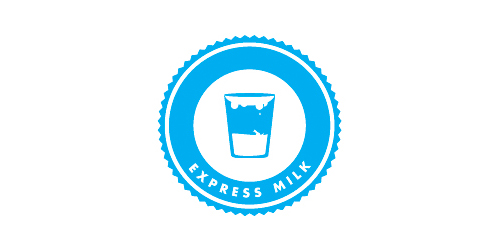
The milk will deliver within 24 hours from farm to bottom. fresh and health.
Logo for an apartment complex in South Carolina, USA

packaging co.


Logo design for an amazingly talented stone masonry company.
The Espace Faubourg, a few steps from the Elysee, is a place for conferences, meetings and events, and also a think tank and an art gallery.