Most viewed logos – Page 491

Hashmeet - Social App


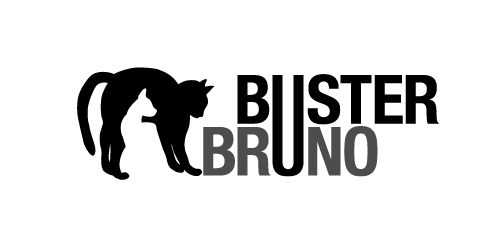
This is a personal project to create a positive/negative identity for a typographic illustrative children’s book called Buster Bruno.
Simple use of the distinctive profiles of Buster and Bruno my two cats uses the negative/positive space to created logo mark. The linking of the u from both words unites the two cats as they are brothers.

"Carry the Love" is a
social media campagin for
One Voice Student MIssions.


Web-site through which people can find work, laying out a summary, and the employer, in turn, find a decent employee

Skydiving equipment

logo design for a local boutique in Indonesia. concept "batique" means "batik", which is the most popular culture in Indonesia. Batik usually appears with elegant & unique design. we decided to make a standout initial which is "B", but with batik feel.
French Kennel by Yorkshire Terrier

..

A logo for a New Mexico spa located by therapeutic rivers

Logo for a motor parts selling shop

A idea for music studio

A logo that represents the global presence in wealth management and promote the name of the company, Dougherty Wealth Management. This client needed to move from a "company look" to a "corporate look". It was important to reference the new logo from the client's older logo but give it a fresh new look, more polished and sophisticated. The client wanted more of a "3D feel" rather than a flat color. The blue diagonals and curves represent global motion while the bold classic "D" promoted the name "Dougherty".

Logo design for a Roller Derby team.


Namami is a leading Florida based Custom Web Design Development Company specializes in providing WordPress Web Design, Social Media Branding services... Namami Inc represents a team of highly skilled and experienced experts in brand development, social media implementation, retail approach, operations strategy and execution with over 25 years.


RENO cafe in egypt

FreshGround is a fun and focused coffee shop. The focus is simple, good coffee.
A wedding identity for Finbar and Amanda who are getting married in October. You can also see a reversed version of the logo live on their website. The theme for the wedding is trees, hence the different leaves used to create the device.
Your music. Imagine it. Create it. PR it.

Small financial company based in New Orleans Louisiana.

Private psychotherapy practice providing individual, couples, and family therapy.
This is simply 2x Goudy g's flipped to make this logo. I thought it would be funny to name it bullshit. so I did.
Online book and music store.