Most viewed logos – Page 484
Logo`s for builder company


MS Groups - Microsoft Groups identity
environmental advice and projects

The logo is self-explanatory: Meal4u is designed as the webadress. A knife and fork stick out from the logo on the left, providing it with a recognisable shape. The colours green and orange support a modern appearance that appeals to a young target group.
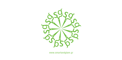
The inspiration of this logo was the scissors that the hairdresser uses to cut hair. The ends of the scissors are the initials of the salon's name "Smart & Glam". A round pattern of the scissors was made as a secondary element.


Poker stakes)

Fishing Resort Logo

logo design for a local boutique in Indonesia. concept "batique" means "batik", which is the most popular culture in Indonesia. Batik usually appears with elegant & unique design. we decided to make a standout initial which is "B", but with batik feel.

Logo for a Nigerian event photographer.

POHTO - is russian way of writing. Logo for furniture firm

The logo was created for IT specialist, which quarantee quality like swiss things.
Typographic logo for a company which sells vector images and illustrations. Type treatment concept. :)


Logotype for the hosting company

an online jewellery company's logo work

Logo for Singapore’s online local humor channel - www.funnymeh.sg The face is formed from letters X & D, which when typed together (XD) form the emoticon for ' really funny ' or ' :D times X '
Music band from Berlin

logo for an education magazine based in mexico.

Glacier Ridge Media created a logo that represents Real Estate and Lending. Neighbourhood Lending is a Mortgage Specialist and offers solutions for all of your financing requirements.


good food with me
A logo for a new artist commerce community
Simple logo inspired by mothers love to their own children.

Beverages.