Most viewed logos – Page 471

Designed by www.logodesigncreation.com


The paper folding toy


Logo of an hi-fi ecommerce website for an application demo

Union Bake

Logo for property investment company - specialising in holiday homes and rentals.

logo design for library

Simple design for animal related companies.

Logo concept/design variation for Seabay Capital


"The concept of a gym nowadays isn’t just about weight loss or muscular mass gain. The Oxygen Gym went through a process of brand development where we aimed to enlighten the good vibes that the physical exercise can bring. So, we presented a brand with no color restrictions so that its application could embrace all of the sports.The color pallete established isn’t an issue as long as there is contrast where the brand is applied. However, because it is a gym that offers several different sports, we decided to use more vibrant colors ."


This client was looking for a vintage surfer feel included into his video production company logo.

Motherfuckers

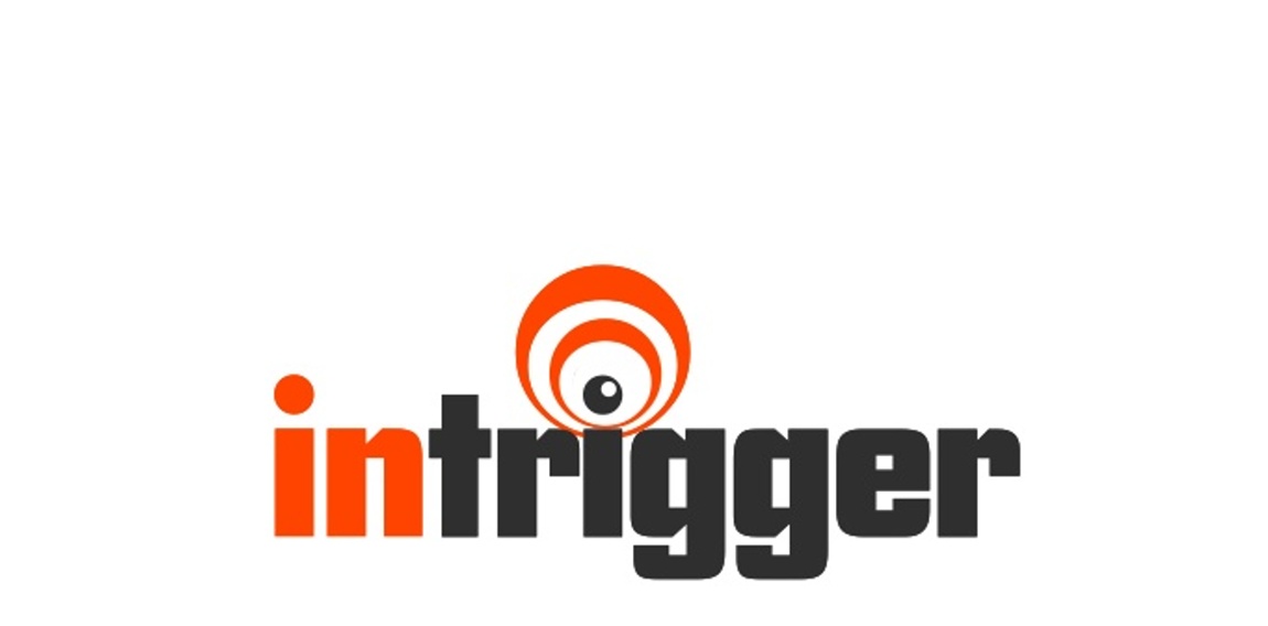
company develops software for content providers that triggers pop up registration after hitting a certain amount of click throughs... thus the TRIGGER... used an EYE because the software is watching the user waiting on clicks and to trigger the popup... thus the wave and "letter i" play

Mill of Nightingale's Land Flour manufacture

Logo done for fun for a fictitious sports team.

Company Logo

LOGO PARA LOJA DE MODA MASCULINA

concept work
Cosmetic tooth alignment company

A simple logo with clean lines for design services.