

Most viewed logos · Page 458

Logo for Performance Training Co. in MN. // Gallery: http://goo.gl/Q3TBR // gopt1.com

 0Nov-08-12


For fun ;)
 0Nov-17-12
Logo design for university housing project by combining a house and mortarboard shape to create one image of a home.
 0Oct-12-15
Winner logo in contest on "freelancer" for mountain shoes sailer
 0Sep-04-14
This is a design I did for Barkway Pet Resort.
 0Mar-03-15
 0Jan-27-25
On the logo:
person ("i")
heart ("love")
angel
 0Apr-14-11
Logo for annual trade show event that would be easily editable year after year.
 0Jul-19-11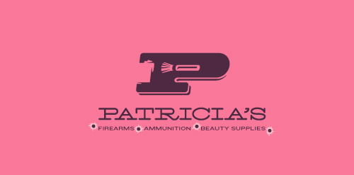
This logo for a completely fictitious company started when I noticed that the negative space with the letter P set in the typeface Blackoak looked a bit like a gun firing a bullet. This got me thinking of how interesting it would be if there were a super-girly, female-owned and operated boutique, catering only to women, which sells not only firearms and ammunition, but also beauty supplies. Everything a modern woman needs! Hey, if you're gonna make up a logo and a company to go with it, why not have a little fun with it? Here, the left side of the P reveals the profile of a gun barrel in negative space, while the negative space within the bowl of the P reveals a makeup brush, which doubles as a bullet being fired. The P mark, based on the Blackoak letterform, is constructed by hand, and the type for "Patricia's" is based on Archive Antique Extended, and is also constructed by hand. I did this because I wanted rounded corners and edges to give the logo a more feminine touch.
Click here to see the case study for this logo, which chronicles its development, and includes full design rationale, sketches, electronic roughs, and alternate designs.
 0Aug-22-11
logo for an educational institute based in mexico.
 0Apr-28-16
coffee shop branding.
 0Sep-11-14
Proposal for a Geek Community from Colombia.
 0Mar-25-14
This we took an old design and color theme... same font and turned it from 1990's to 2010's - Used the D and spun it... got a cool circular icon
 0Oct-20-15
Den Ouden Paprika produces peppers. Really each pepper goes through our hands before he leaves the greenhouse. They can rightly say that they have a 'heart for quality'.
 0Aug-17-13
TELFOR (Telecommunications Forum).
 0Nov-25-15
 0Jul-28-24
dental clinic
 0Jan-28-14
Brand identity for Line Digital
 0Jun-11-13
ISM Promo is a company to organize events and trips
 0Oct-29-11
eotfast.com helps you convert TTF fonts to EOT. The logo usages a cheetah to convey speed.
 0Feb-04-11
 0Dec-06-10
Logo for dance group - RyTM
 0Nov-16-15
logo for a small architectural firm based in mexico.
0Apr-28-16
Cupcake, Bakery Logo
 0Sep-20-14