Most viewed logos – Page 420


...

Holist Therapies Clinic

Maritime Heritage Tours is a project supported by the EU. Maritime Heritage Tours offers a combination of historical sailing trips on the Baltic Sea and visits to attractive sights in the five participating countries. Idea: A ship. An EU star. Historically, stars were used to navigate ships. The 5 pointed star symbolizes the 5 participating countries.

Stock photo website logo.
Logo for a travel agency based in Managua, Nicaragua The company wanted to reflect a modern, fun and energetic logo that makes it stand out.

Online shop for golf equipment. Kewl/cool golf symbolized with two golf clubs which are also sunglasses.

Logo for my personal website. "Mike Sokolowski"

TETRPHASHE is marketing consultant company which needs a logo for their new business. They want a logo that has both text and symbol. So that symbol can be used independently when required. Symbol should have something relating to marketing. I designed the logo keeping in mind the design brief, in this logo the symbol is make of alphabet "P" which is revolve in a way to make four P's of marketing mix, around these four P's all the marketing revolve. And is summed up in the logo in a simple but unique way.

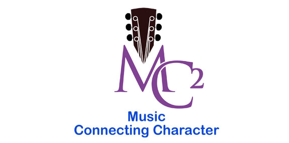
This organization performs musical assemblies for elementary school children highlighting Character Development: avoiding bullies, not being intimidated, not joining cliques or being intolerant of others. Client wanted logo to address music, what he wanted his firm to be called ("MC-square", and he wanted an monogram-type letterform arrangement.

As member of the EUVIBIZ, experienced tour operator since 2007, EUVITOUR has becomed one of the leadingtravel companies in Germany, specializes in organizing delegations from Vietnam, tourism, market reseach,experience exchange, business cooperation, fairs,etc ... in Germany and throughout all European countries. (analytics this logo at http://yviet.net/projects/euvitour/view.html )


ONline Ticket seller for sporting events. Incorporated ticket stubs into the name along with a subliminal "check mark" which is iconic for done, complete, success...

Logo para programa de proteção infantil da prefeitura da cidade de São José do Rio Preto. Logo for the child protection program of the prefecture of the city of São José do Rio Preto.

Logo for an India Restaurant.

Inspired by Super Heroes and Greek Legend, Urban Jungle designed the Guardian identity. Integrating the “G” of the product’s name into a Captain American-esque shield, and using a charcoal colour treatment on a bold stylized version of the Gotham typeface, the identity blends a vivid colour palette of pink and purple, giving the identity strength and modernity.
Healthy food company logo

Logo that expresses smiled face within perfectly arranged letters in pixel grid. Rejected proposal.

Furniture Factory