Most viewed logos – Page 36
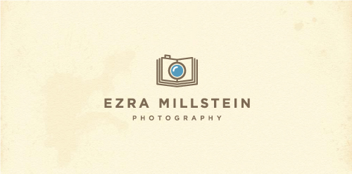
Logo design for Ezra Millstein, a professional freelance photographer and staff photographer for Habitat for Humanity International who likens himself as a “visual storyteller” hence the book/camera.


Word 'dig' with the shovel in the negative space
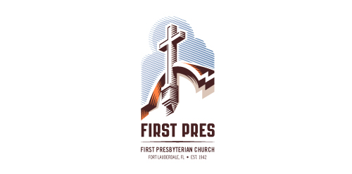
Redesign of the church's old logo in a stylized, illustrative manner, making it more welcoming, contemporary, friendly, casual, & upbeat. Client specified a rendering of the church’s architectural arch and cross in the perspective in this photo, and required an emphasis on the church's nickname, “First Pres."
Here, crisp, exacting vectors emphasize the architectural soundness of the church — a metaphor for the concept of faith as the solid foundation in one's life. This design makes use of hatching to add gradient dimensionality, enabling it to easily reduce down to 1-color. Colors are indicative of the building itself, including terracotta roof. Check my Flickr case study or Dribbble for more images, detail, and full design rationale.


Logo for funneral company

Submission for a contest.

Organization of holidays (Cartoons)
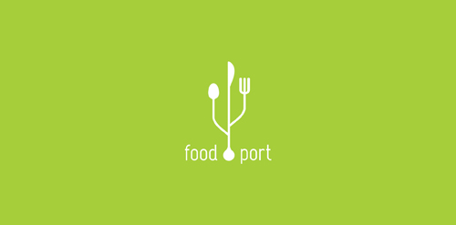
Conceptual logo showing a usb icon with cutlery.

Monogram


in black
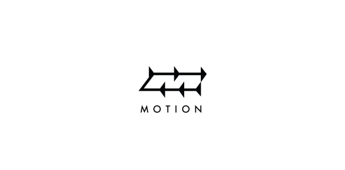
Directional arrows representing motion also form an 'M' in negative space.

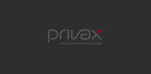
For a VPN Service (virtual private network) named Privax which helps secure your internet connection + helps protect your online anonymity through encryption. Custom made font. The concept: the x symbolize an abstract protective shield with which you surf anonymously, the red bar is the outside world / hacker etc...

Wellness Center "AQUA". Sauna, russian-sauna, SPA-procedures.

Logo design for Red Ink Tattoo Studio.

Unused proposal for an aromatherapist.

Rasa ( Essence) Drop In an abstract B Form.
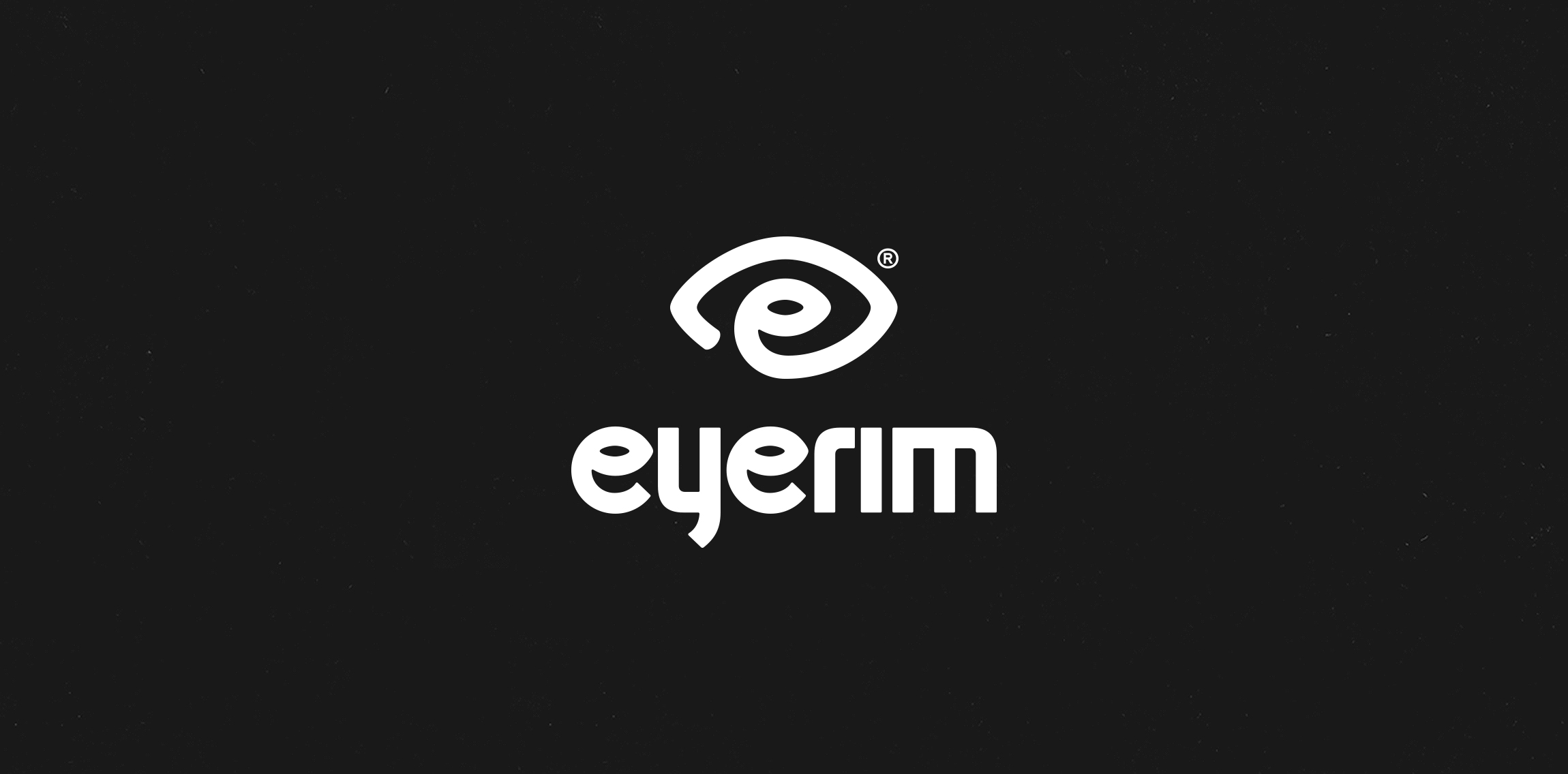
Eyerim is fashion eshop selling designer eyewear across Europe. Basic symbol of the new logo is eye. It is the combination name (eyerim), symbol (eye) & initials (e).

Two "T" connected with tower in negative space.

Dubai Internet City Logo
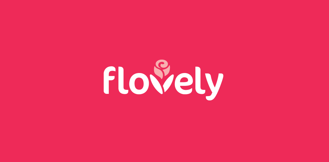
Logo for a website that selling gifts online. All the gifts will include preserved flowers in the boxes. I incorporate 'v' with a 'rose' to represent this brand and the client love it. :)