Most viewed logos – Page 34

Sportswear.


Brand mark idea for movie production company. :)
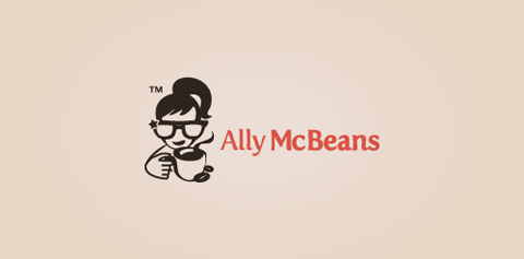
Logo for a social community website for coffee lovers.

code concept typo
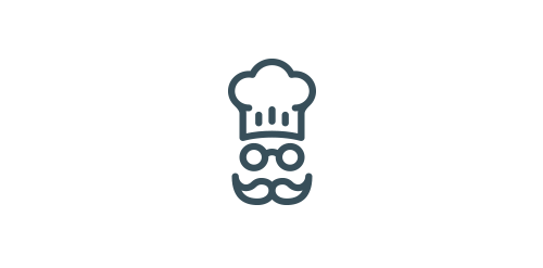
Chef logo for sale http://goo.gl/6pcE7t

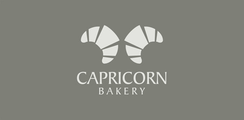
Logo for bakery. Two croissants as hornes.

Logo for food and drinks

Marine cafe. Network of catering.

Vegan baked goods - 2011
Project for a vegan muffin and cupcake shop; name is a play on the traditional "better of dead" remark; not taking credit for the name tho, as I wasn't the one that came up with it.
Leave a rate to show some love!!

for sale

Logo made for Norway based hi-end clothing line. SÖLVREVEN > Silver Fox in Norwegian.


dream high

Logo designed for restaurant in Leeds, UK. A stylised chicken mascot with flames depicting hot wings.

Rent a Chef

Designer: Denis Aristov | Client: ISOCARP | Industry: Event, Congress | Keywords: 48th ISOCARP Congress Perm – Fast Forward: Planning in (hyper) dynamic urban context


A logo for Restaurant coupon site

Coffee and panini shop focused on quality, featuring locally roasted coffee and italian style panini as well as fresh baked goods.
It combines Lion and Share Icon and is coined from the word "Lion Share" which means having a major share.