Most viewed logos – Page 329
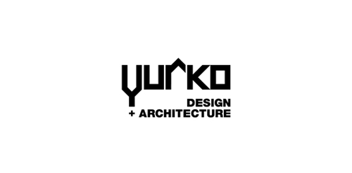
Proposal for Yurko, which is an architecture design agency.


for panoramic wiew project.
Logo for Wats (Wearetheshit) — Bar and club located in Belgrade, Serbia.
Second try logo. It's an iPhone app logo wich I'm currently working on.

logo for a creative agency

lettering

Logo for McArthur ranch.
Clean Code is a logo design for programmers that provide a smooth final code, easy to read and understand, hence a clean code. More: http://bit.ly/1vBBRjv

Tourism guide - know your edge Stylized footprint, the idea is that these curves represent the trip, during which we visit all the places in Lithuania(can be your country), and Lithuania(can be your country) shows instead a thumb. That would put a hidden message to the customer (tourist).

Yahzy LLC is a NYC-based company that provides original compositions for films, TV commercials, concerts and corporate events. It also produces music tracks for singers (ranging from broadway, TV celebrities to indie musicians). The target audiences are film/TV industry, show business, as well as national/local musicians who seek quality original music that is tailored to their specific needs.

For fun
Logo for a small scooter and motorcycle shop.

logo for a new apparel brand...

Logo in the shape of a cherry in conjunction with two hands and a dumbbell with green, red and black colors. logo for sale : https://inovalius.com/item/cherry-fitness

Cartoon logo design. It means "Be like a God". This logo is ideal for fitness portal. And it is for sale (kacper@x-mind.pl).
Inspired by the Spirograph, Urban Jungle designed the identity using a combination of four semi-transparent aqua and ochre circles. The circles symbolize the convergence of two unique corporate entities into one new corporate brand identity — Vantage. Using charcoal for the typeface, the identity blends a vibrant colour palette giving it a fresh, smart and energetic feel, and reflects the youthful and contemporary edge of the company.
Fungnuehc is a small team of passionate creators changing the way you think about handmade leather. We do everything ourselves from start to finish here in London. Playing typography for the name of 2 owners. "fung" and "cheung" to be the logo. http://www.fungnuehc.com/
Creative logo.

Soccer crest design for Penn State women's soccer
This was done just for fun But if you're interested in this logo it is for sale Thanks for clicking
This logo was created for the Cape Fear Aquatic Club Storm. This logo uses the hurricane flag as both the flag and the "O" in the word storm. The flag shape has a wave and tattered edges subtly referencing the bravado of the team.

logo designed for social welfare center
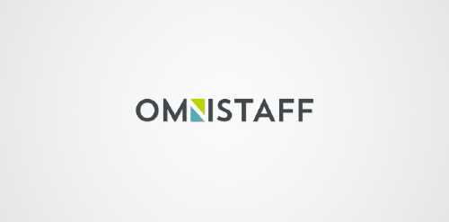
This was a commission we received from a company called Omnistaff - A recruitment Agency based in Johannesburg, South Africa. The company required a minimal logo that signified the multilateral approach they had to staffing solutions. This logo makes use of clever negative space to create the N, which just so happens to look like two arrows pointing in different directions.