Most viewed logos – Page 316


Viet Art - architecture interior design

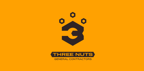
This logo is for a completely fictitious entity named Three Nuts General Contractors.
The idea for this brand came to me when I was out and about in the world, and saw a contractor's work van drive by. As I looked at the number 3 in the telephone number on the van, I started thinking about how a cleverly constructed 3 could reveal a wrench in negative space.
Using a hexagonal bolt nut as my main source of inspiration, I thought of a whimsical name which would support the concept I had in mind. In this hypothetical situation, the "Three Nuts" could be a team of three general contractors.
The icon is built from the angles of the bolt nut, and the entire mark should evoke a heavy industrial feel; something that could be stamped into metal, etched into wood, or simply affixed on the side of a work van.
Click here to see the case study for this logo, which chronicles its development, and includes full design rationale, sketches, electronic roughs, and alternate designs.


Mud Gear

Logo/identity including slogan for Motion Birth designed for Werox, Sweden.
Motion Birth is visualising various life science areas through motion graphics.
The logo is inspired by the science areas Motion Births motion graphics are made for. It has a resemblace to star clusters in a spiral galaxy and molekules in a DNA string.
The logotype is custom-made

logo garden
Logo for media streaming company


Non-profit Project

Pastelove

Logo for online service that allows you to film the unique moments of your life and create unforgettable videos
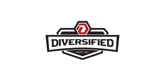
Custom Logo design project for diversified.contractors


Graffies - is a source of Showcase & Discover Creative Work

This logo is made for a small, family owned store that sells mainly drapes but also other home decor products (such as clocks, coffee tables, ornaments etc. )

Logotype for security company.

Sunny Wines is a small wine importer from Warsaw/Poland. The aim was to combine letters SW with wine symbols like grapes or cork screw, but the client wanted to see also more elegant symbol combining those letters.

Another option for the series of logos made for short-runs on caps, t-shirts, etc.

Mill of Nightingale's Land Flour manufacture. Version two

Logo for nutrition drink, with body builder created within the negative space of two S's.
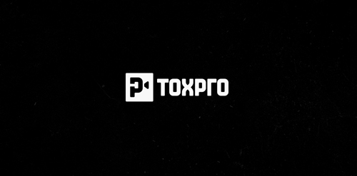
Logo for TOXPRO - production company. Logo idea: monogram letter T+P (Negative space) + camera symbol. Custom typography inspired Azbuka Alphabet. Founders come from Russia, would like to have in the logo russian element.
