Most viewed logos – Page 317

Supplier of food products from Armenia. NUR in Armenian language - pomegranate.


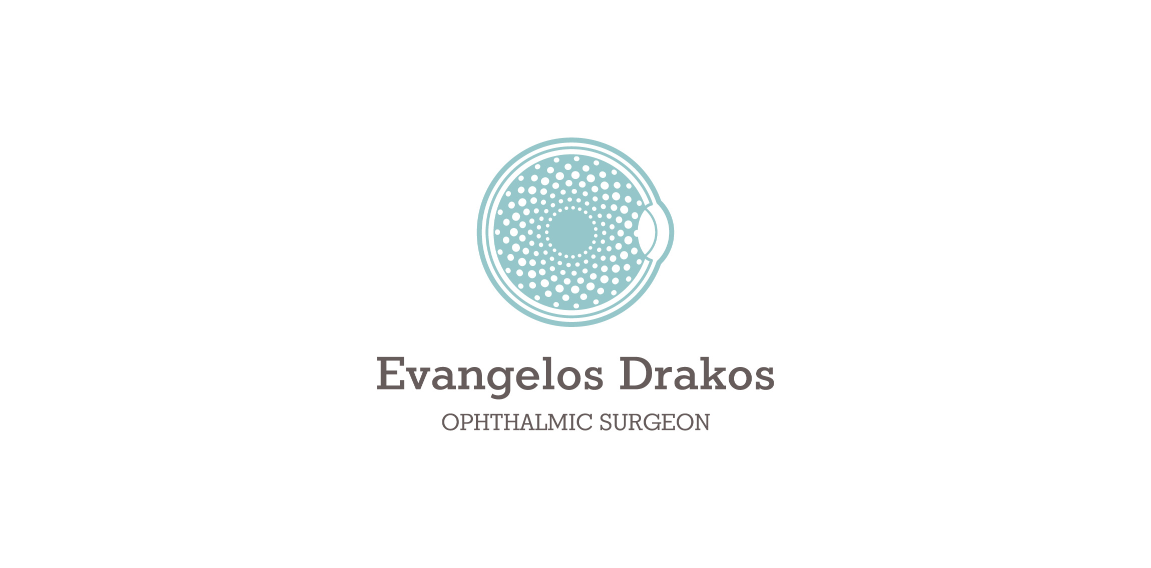
This logo was designed for Evangelo Drako an ophthalmic surgeon


Creative, enthusiastic and critical graphic design student with a strong confidence in the quality of their work. Punctual, polite and very demanding with himself for a job well done. Created in Colima, Mexico, and wears glasses.

Pharmabond are a new medicinal supply company in the US, deal with mostly bulk supply for private practices. The apple represents health; it is a continuous line with a loop implying ongoing health. The loop doubles as a droplet, to symbolise medicine, water, purification, etc. The leaf is also a subtle P. The blue enclosure is a protective seal to ensure ongoing health.
CAR

Logotype for security company.

Logo for online service that allows you to film the unique moments of your life and create unforgettable videos

Photographer logo


Victoria is a financial fund based in Warsaw. The key was to combine a eagle (symbol of Poland) and V letter (for Victoria). There were several concepts - some modern, some classic, more decorative with a pinch of victorian styling.

Logotype with russian character. Special work
A logo design of a security ring that is made into a map pin. Logo design is available for sale.

This logo is inspired by the wedding photos I wanted to merge over something simple these two symbols representing love and photography.
Bamb Bamb is a Campaign Management company based in Eastbourne, UK. Logo designed by Simple as Milk.

Sophie is freelance writer, she wanted a artsy feel to the her logo ( very approachable ). So, I went with a watercolor approach. The pen head is the basket of the balloon, implying that she lifts people up with her writing.

Newborn cloth

Unique and stylish logo design for coffee related business.


My new personal logo, inspired on my initial and a check mark.
Logo for mobile game pitch.