Most viewed logos – Page 243
Logo for Properties Red Sea company located in Hurghada, Red Sea


A startup outsource co. logo


Composed of text, the letter S which represents the snake. This logo is simple, needs fewer colors and effects. It's easier and less expensive to use.
Logo for beauty products

Unused proposal for a news website/blog

New logo for a fashion and accessory brand called Heidi Mottram

Perfect for photo business. For sale.

Custom logo design I did for Playto+ in 2013.

Logo proposal for a childcare center / playschool
Economic society "Gudratly Mekan" leads design works of construction and building works of residential buildings, cultural and educational centers, sport objects, also construction of roads.
Registration of the foreign companies

Lifestyle portal: art, culture, education, events, places, fashion, music ...

Mark for a local honey producer.

Logo for design of studio https://www.behance.net/WiktorAres
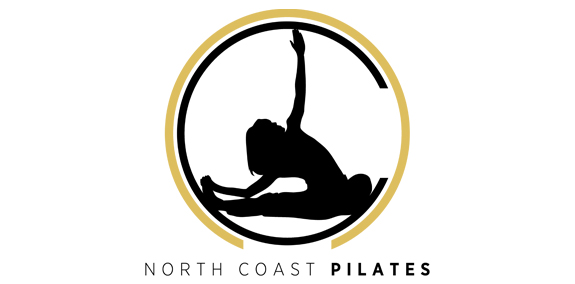
In concept and creation, we wanted to bring some continuity with a previous circular logo design, but incorporate the North Coast element too.
Health Clinic Logo

Final logo design variation for educationoption.com


Logo for an online blog host. The mark is a combination of a sheet of paper and a letter S.