
Most viewed logos · Page 24


First letter of first two words of the name - letter "M" made using pet silhouettes. Unused concept.

Bicycle rental service for passengers of the Beauvais airport and its employees, or city inhabitants willing to enjoy a fun ride, Aerobike is an innovative service that launched in summer 2010. Brand Brothers created a complite brand identity with a dynamic and fun spirit. With a special typography created for the occasion, an easily identified sign and a strong and colorful graphic, Aerobike is now noticeable in the surrounding landscape!

Unused concept for a client. Custom made calligraphic logotype.

Creative Agency in Russia.

Guess who's tired from standing since the day it was discovered :)
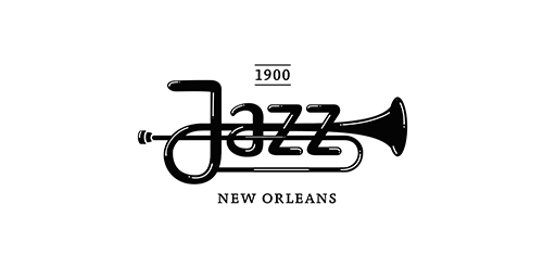
Jazz -New Orleans

Purple rats - logo made of abstract, purple color, shapes. This logo can be used for any industry. The logo represents courage, precise, modern, aggressive, etc
Ian Grant is a photographer based in Edmonton, Canada. Logo features both a monogram as well as an image.
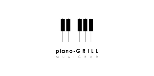
Logo for music bar or restaurant.

Logo proposal for a Corporate Gifting and give-away company

'Higher Grounds' is coffee shop in Cloudcroft (New Mexico) situated 9000ft above the sea level with cool hills.. It's a kinda tourist spot.. So that's where this logo came from.. My idea is to show the place (Cloudcroft) with mountains and to take it over the coffee in a single line drawing.. And few colors added to make it more scenic by having the business on the core of the logo.. so it's kinda 50% for the business and 50% for the place..

Logo for a company that provides solutions and apps for facebook, iPhone, android and other platforms.

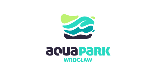
Competition project for a new logo AquaPark Wroclaw, which was awarded from among hundreds of works.

Logo for the company producing popcorn.

Exclusive Customizable Logo at http://wp.me/s4571j-focuslab

one of the rejects designs for
http://mind-gate.eu/
follow me on my FB:
http://www.facebook.com/yaceky

http://www.facebook.com/yaceky


Logo for restaurant and bar. More on: www.onedot.pl
