

Most viewed logos · Page 221
A brand new photography business specializing in dog photography.

 2May-28-12


 0Dec-15-08
"Iguaçu is the second biggest distributor of optical product of the South of Brasil and they were searching for the repositioning of their brand. We worked with a new communication aiming at the values of the company, which is about commitment and responsability.”
 0Nov-09-14
My logo design is based on the structure of the letter 'A' in combination with the form of a flint arrow head. Arrows have a connotation to meet targets which graphic design projects are based upon.
 0Jun-29-15
A kangaroo working out with some dumbbells.
 0Apr-08-16
ADMIRON is fresh modern dynamic logo with short easy memorable name. It will suite well to any business or industry.
 0Apr-17-15
logo for a cake shop company based in mexico.
 0Oct-25-16
aarto is a small architecture design studio based in Warsaw/Poland. The aim was to diffirentiate 3 areas of expertise: Architecture - Urban planning - Interior design. We wanted to keep it simple and modern.
 0Jul-10-17
 0Jan-04-10
Mobile applications developers
 0Jan-09-13
it's a fluid-like logo because the website is all about after effects and motion graphics... I choosed fluid because it refers to motion and like that it can be easily remembered.
 0Sep-17-13
Bird logo design with golden ratio grids. You can buy this logo. Just send me a message or see more on website: www.dainogo.net Grids and animal logos | 02: https://www.behance.net/gallery/52457649/Grids-and-Animal-Logos-02
 0Jun-14-17
 0Oct-30-09
This logo was developed for Heim by VisualCast Designology. Heim is the authorised international distributor of Leicht Kuchen and Rolf Benz, which are Germany high-end home furnishings brand. Heim’s retail stores is located in Surabaya and Jakarta, Indonesia. The logo is comprised of clean, simple and modern custom-made lowercase typeface. The feel from the logo is personal and luxurious. More information available at http://www.visual-cast.com.
 0Apr-17-14
EvaSecret | Lingerie online store
 0Oct-08-13
Cautor, an fashion thing.
 0Oct-27-13
 1Sep-28-10
Logo designed for a New Zealand clothing label.
 0Jun-23-13
We are a craft coffee company that takes pride in educating our customers on third wave coffee as well as continually striving to offer the perfect cup of coffee. Eventually we will be roasting personally sourced coffee beans in house.
 0Apr-05-16
JF Assessoria de Imprensa
 0Jul-31-16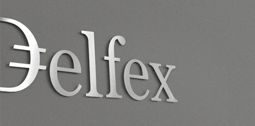
Logo and corporate identity for company trading with foreign currency. I was working on this project last two month. I made for client whole identity set from logo design, stationery design, web design with programming part, copy-writing including slogan and finally design manual. Logo on this photo is mounted in headquarters office on a wall. It was carved out of brushed aluminum plate to gain metallic look which is symbolic interpretation of currency, money and prosperity. Metallic effect literally connects whole identity. All stationery is printed by PANTONE 811 C metallic silver color. For selected materials such as business cards, compliment cards, envelopes and documents folder was used special silver metallic paper.
 0Jul-11-11
Mini-grocery
 0Nov-05-11
Scrolling survival horror RPG that will leave you ‘rooting’ for more!
 0Dec-04-15
beta jewelry
 0May-19-17