Most viewed logos – Page 219

Mark created for a special event around sustainability that fell on St. Patrick's Day.


logo for a cake shop company based in mexico.

it's a fluid-like logo because the website is all about after effects and motion graphics... I choosed fluid because it refers to motion and like that it can be easily remembered.

logo for the event - bowling tournament ы steady advertisers. We decided to abandon the standard picture of balls and have fun logo, because the play will be creative people.

Carpenter

Place for little artists, scientist and fun lovers.

JF Assessoria de Imprensa
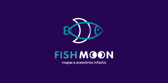
Logotipo para loja de roupas infantis


Dumma Branding is the design house of Duminda Perera. Duminda is currently involved in an ongoing logo project for design every day one Original, Clever, Wordmark/Verbicons or Negative logo.
Logo for Fish Pass Lego.

Design Carnivore
Logo for face detection system.
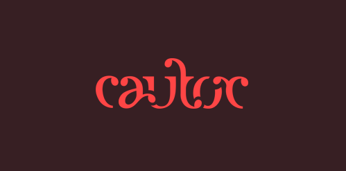
Cautor, an fashion thing.

This logo was animated by Dan Johnson of Spin My Logo http://vimeo.com/19396575
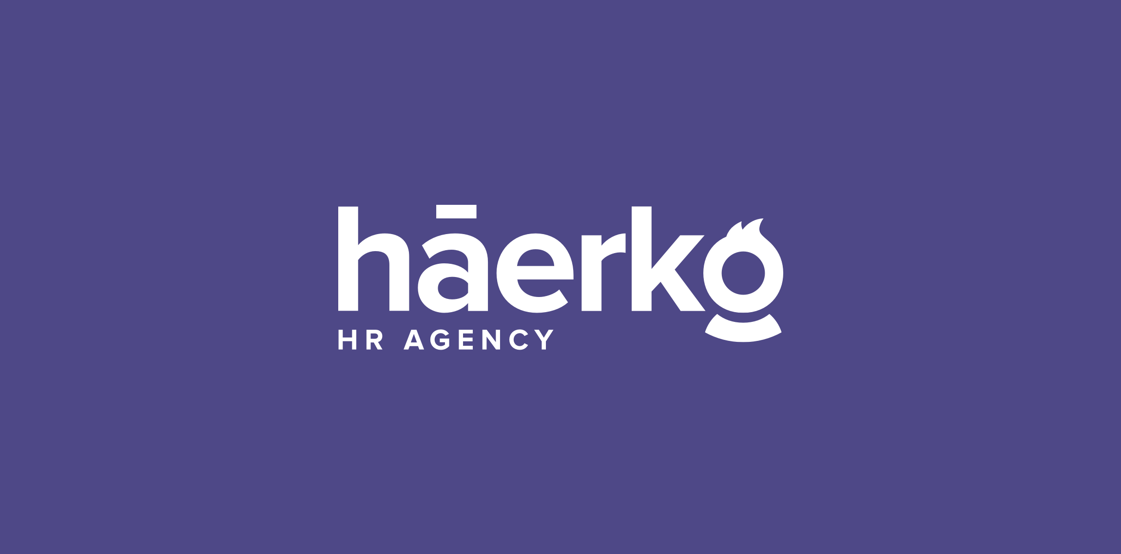
Hi everyone! My latest logo design for háerko - HR Agency. The point is the hidden men/women at the end of the logo. To be fair, I made multi-sex versions :) Check full version on my dribbble: http://bit.ly/1R8fp9v
Logo for a German producer of high-quality wooden furniture.

Possible logo for Aces a division of Acesse

Logo for medical website.

aarto is a small architecture design studio based in Warsaw/Poland. The aim was to diffirentiate 3 areas of expertise: Architecture - Urban planning - Interior design. We wanted to keep it simple and modern.

Guillotine concept typo

"Iguaçu is the second biggest distributor of optical product of the South of Brasil and they were searching for the repositioning of their brand. We worked with a new communication aiming at the values of the company, which is about commitment and responsability.”

Just for fun
