Most viewed logos – Page 177

Logo for interior designer


Ballet

An idea which was not used.

Ready Made Logo sold for a brand named Puzlet at http://wp.me/s4571j-gearman
Mobile application logo. Kid Tracker is a new app for parents who want know were is there kid. http://kidtracker.pl http://onedot.pl
Acid Animation: creating movies

Conceptual logo design showing three flowers in an upward bar graph style to represent growth. For sale

hotel chain

Logotype for everything that is associated with art.

YoguPop - Frozen Yogurt

Symbol for the eye clinic called Øjenklinikken Diakonissestiftelsen, located in Copenhagen, Denmark

Logo for Lux a Managua based brand who creates personlized candles for events. Look for the candle container in the negative space in the letter u, ;) More here http://bit.ly/DaininSolisDesign

Logo for a hotel

my initial in unreal 3D

Unused concept for client for an upcoming online cloth store. Spanish word Vivo means live, alive,living, lively, vivid, hot, bright, quick, vital, active, rich, smart, animated, happy, etc.

Logo for chat app

Rectrangle is a multimedia brand. Name consists of three parts: rec, rectangle and triangle. These parts form a camcorder.

Logo for Lake Wilcox Brewing Co.from Richmond Hill, Canada

https://www.behance.net/gallery/7975715/Polleria-Suprema (Supreme, an essential part of the chicken that manages to draw the two sides on the side of the chicken breast skeleton. The brisket. Each of them open with a knife carefully, since the meat is very delicate, it flattens. They are ideal for them with a variety of fillings, rolled and cooked as a stiff, or make patties and other foods.)

A combination of continius round shapes and sharp edges to form a logo to represent speed, curviness, emotion, risk.
"Rumba Scissors" is a fun logo depicting two symbols merged within one, a pair of scissors and the second, a pair of "maracas" music instruments.
Logo for mining company.
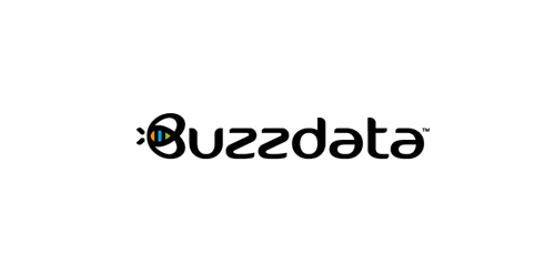
BuzzData is a social platform/network where you can publish and discuss data. BuzzData lets you publish your data in a smarter, easier way. It's about data and a part of it to visualize the information. You can attach articles, visualizations, apps and even source code... etc. www.buzzdata.com Identity solution: A custom made uniqe Typography with a varying thickness shows buzz and motion. The front letter "B"ee can also be used as a standalone favicon which is very important for a social network company since it is easier to incorporate it in very small sizes around the web for buttons and links. The Bee has a uniqe shape, is very memorable and iconic. The colors which are used into the negative space of the bee are resembling the companies main product >data< which comes from the social network users in unlimited variations... everyone can publish and discuss data. The color forms are reminiscent of chart bars, pies (statistics).