Most viewed logos – Page 161
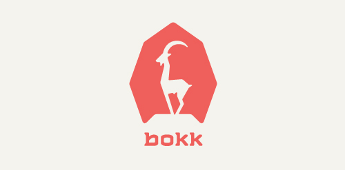
I recently realized I've never designed anything animal related. So I decided to give it a try with this ibex. The logotype was custom made and incorporates characteristics of the ibex. (The name bokk is derived from the word sprinbok.)


This is a logo for company making Roller Coaster.

omar Kitchen design

Imkerei Wojciechowski is an apiary from Austria. This contemporary geometric linear logo for an apiary reinterprets in a fresh way symbols common in the apiculture trade. The image of a bee emerges out of intersecting hexagons of a honeycomb. It creates a layout, whose aesthetic strength lies in the logic of construction. The logomark is complemented by the brand name written using an original angular typeface.

Logo for a consulting company.
Logo for multibrand. Clothes, perfumery and etc.
Logo for music club

company logo for advertising media and public relations

Italian software house https://www.behance.net/gallery/19643809/Gemma-Software
Pixeland logo

A clothing brand with a minimalistic traditional take on modern fashion, inspired by Japan.

Logo design for an personal and property protection company, Hungary.


just logo

Logo for architectural company.
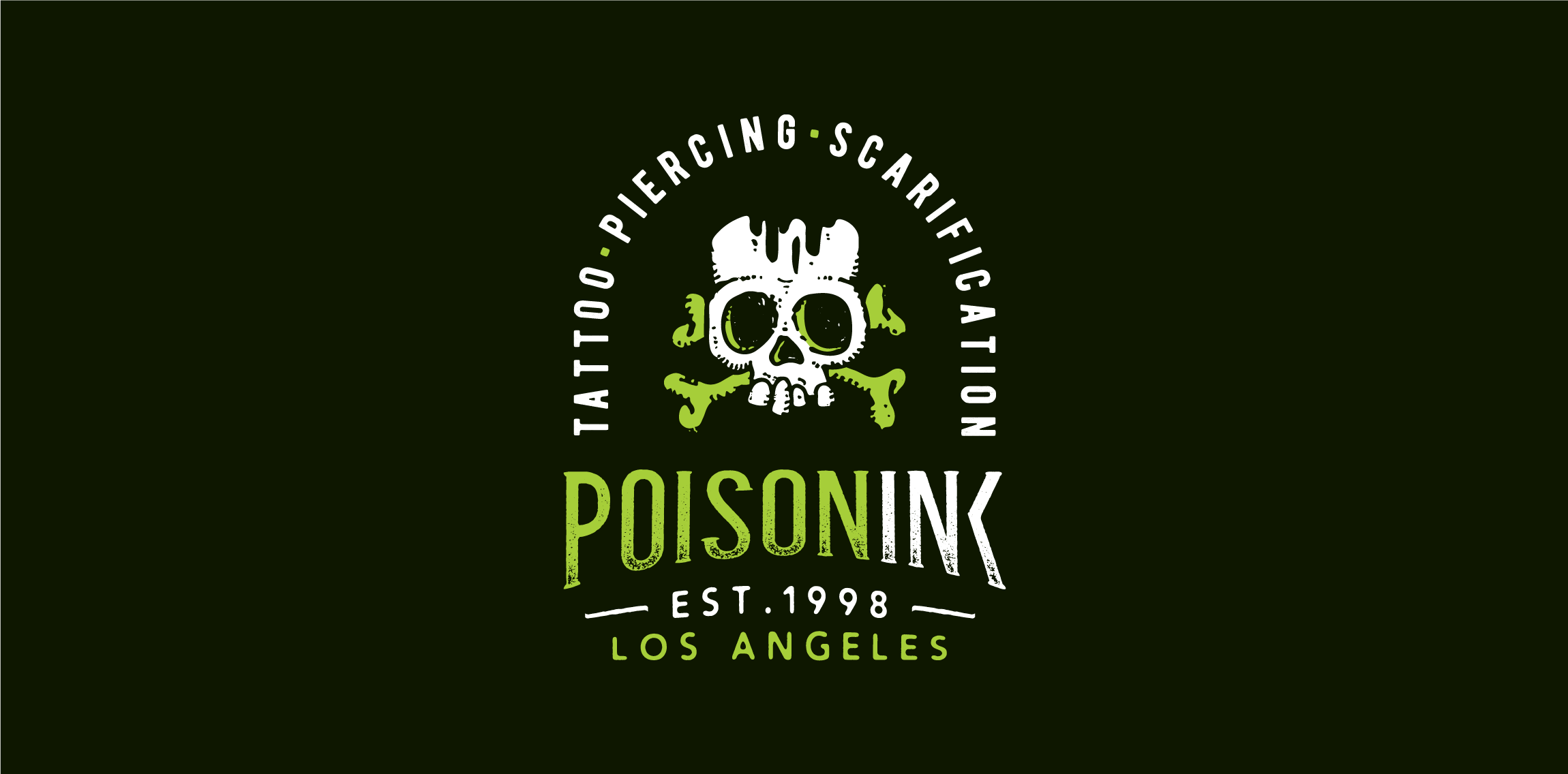
Playing around the naming, drawing & typography: Poisoning + Ink = POISONINK Dabum tsssssss!

Visual concept

Dommoka coffee beans, coffee machines and coffee service logo

An option logo for architecture company
4cussite is photographer group of 4 Japanese university students. I joined this group, and I designed logo. Member have own color.(Blue, Red, Green, Yellow) I used 4 color and 4 shape, and made a simple logo.

Garden company www.gardenika-lubin.pl

Евразия Логистик. Logo for Russian company specializing in wholesale and retail trade in rolled metal, plastic products, provision of transport services. Symbol built from the first letters in the form of stacked pipes.