Most viewed logos – Page 136

Logo concept for kingveg.com


Dutch financial and trading company for crowd trading.
This logo for Pictosynthesis plays on the brand name by using the rainbow of colors found in a light prism to represent "synthesis" and arranging these colors in the shape of a camera lens to represent a "picture."

Registration of the foreign companies
It is a watch company that donates the proceeds to charity.

Client: Dream Photo Tour Location: US Branding Agency: Bratus

Symbol of the flow of logo idea into empty vessel.

I create this Logo with simplicity.Like this Logo? If you want to buy this Logo you have to go to this URL--- http://fiverr.com/ikramshagor

Designer: Denis Aristov Client: Museum of Spoon Industry: Tourism, Culture Keywords: Museum, Spoon, House

for new branding agency wildcube.pl

https://www.behance.net/gallery/25749813/J-U-L-I-A-S-E-N-N This brand has a strategic objective to communicate through a set of visual signs a Co-creation business related to womenswear. Generating products for a style of fun, dynamic and haunting woman expressing sensuality and want to look different market trends daily. Thus transmitting mystical light, magic and freshness. "For all women looking surprised and feel unique."

"The project for Architect and Urban Planner Laura Alves was based on the abstract forms and drafts used on a daily basis of the architect. We used orange as a color base because it inspires creativity."


Perfect for poker club. For sale.
ATL logo / www.nlogo.pl
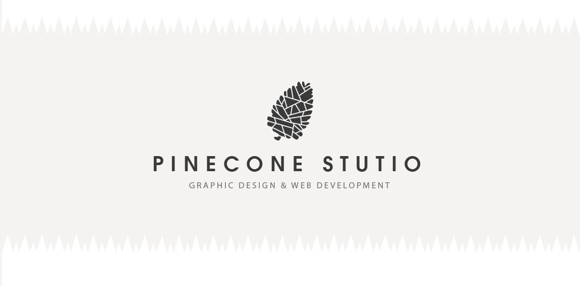
Free logo design of pine cone for personal and commercial use
.
PROJECT Panax Pharma is Czech based distributor of medicines and pharmaceuticals. I was asked to create simple and distinctive visual identity including logo manual and stationery. CONCEPT The logo contains stylized illustration of medicine mortar - traditional tool used for pharmaceuticals production and processing. The mark is reflecting susceptible and responsive approach of company through subtle rounded stylization and refined execution of it's design. Negative space used in illustration of the mortar also inspires emotions of preservation and processing content from out. Finally Optima typeface with turquoise and silver color palette completes company corporate identity design basics.

Producer of anti-theft systems into flats

twins

logo for a local liquor store specializing in wine
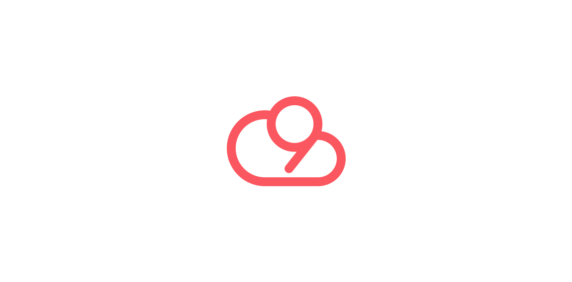
Cloud 9 is presented through combining the form of the number 9 within the cloud structure.