Most viewed logos – Page 133

emigration agency, property in other countries.


Logo-mark design for Hankie, a web-tool where you can plan trips with friends. It helps you to streamline the process of planning a trip collaboratively. And to discover new ideas about places that you have never been from the other users.

Ready made logo design.


Some experiment about verbicon, i hope you like :)

Raleigh is known as the City of Oaks The owner wanted to encorporate his initials in the butterfly which are JMB He didnt want it to specific to only Raleigh business so adding a skyline with a vintage touch

eco S
For typography & graphics academic circle in Wyższa Szkoła Technologii Informatycznych w Katowicach.
Typographic logo for water sportswear brand that expresses the waves & turning just like in the surfing.

Logo for cycle of genetics lectures.

The design resembles a camera and a bag.

BraceMedia - Clien twork
For purchasing contact me.

Identity for the company Puzzlebox Potential that specialises in learning techniques. The concept was based around the caption 'unlocking learning potenial', whereby a key was created within the negative space of the characters.

My new personal logo. Full project on Behance: http://www.behance.net/gallery/Self-Logo/1470725
A zero with ones around are making a gear on the space between them .
Logo for a art photo house.
my new personal logo


The name is formed by merging two words "scrib" (root word which comes from the Latin "scribere" and means "to write") and "bird". The image (subtle S-shaped) also consists of two parts, a nib and a feather (a feather pen), it can also be seen as a head and a wing of the diving bird (e.g. blue-footed booby). Dive into writings.
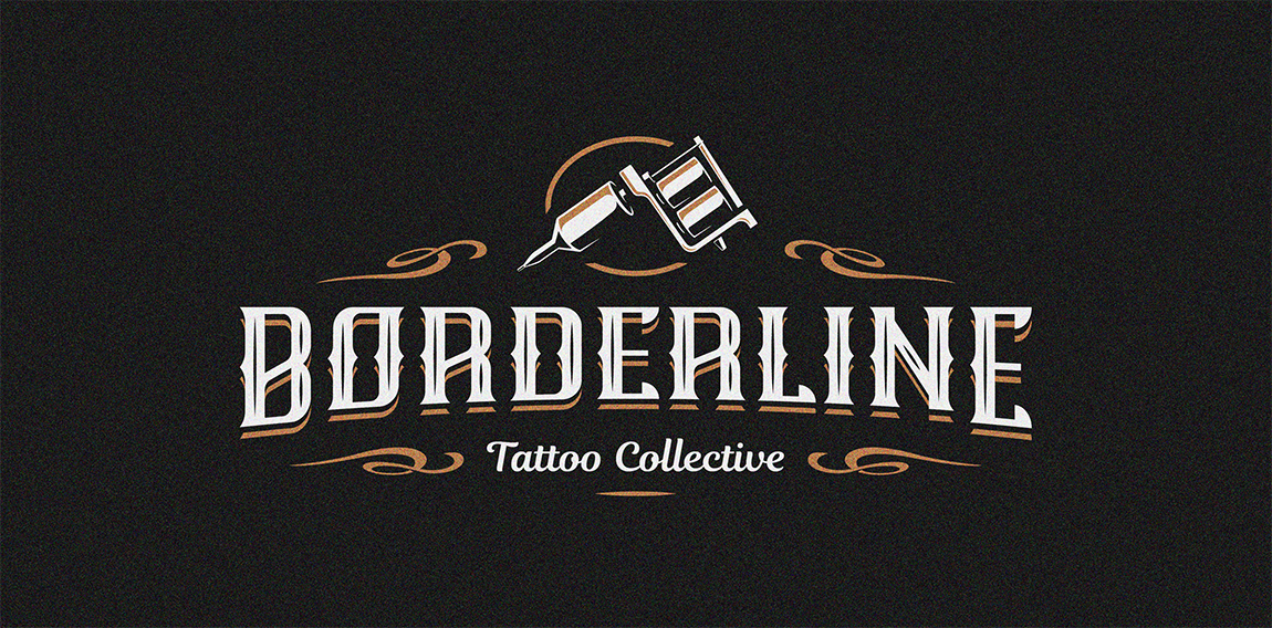
BORDERLINE- Tattoo Collective

Logo for special packages food delivery company

Fresh, juicy, tasty... but most of all funny and friendly logo full of happiness suitable for a wide variety of business. Sky is the limit ;) ...floomba!