Most viewed logos – Page 116


...


Unique logo design for design and creative services. Can also be use for media and art production.
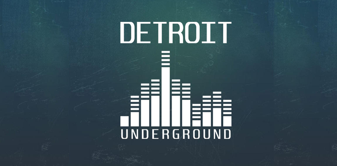
The Detroit Underground logo utilizes a flat minimal design, also featuring a graphic that resembles a skyline and a volume equalizer.

Some experiment about verbicon, i hope you like :)

...
![Ideas Infinitas [infinite ideas]](https://logomoose.com/wp-content/uploads/2013/04/ideasinfinitas-01-01.jpg)
Logotipo de mi próxima agencia de diseño. Como el nombre lo dice representa una constante producción de ideas originales. Los dos bulbos aluden a las IDEAS, que al unirse (los bulbos) forman el símbolo de INFINITO.
[My next logo design agency. As the name implies is a constant production of original ideas. The two bulbs refer to the IDEAS, which to join (the bulbs) are the symbol of infinity.]

The horizon brings about a reel of hipe while the red was used to depict a bright, glowing and rising organization
KOBALT pracownia projektowa

БMA | Design Union

My Bagel logo
Ponder logo
Happy Sloth by Boldflower Design Studio
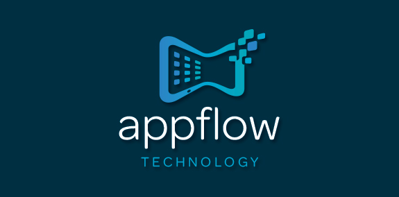
Modern, organic shaped, uniquely designed smart tablet logo, incorporating the idea/concept of tablet apps in motion. This tablet logo design is created with a warping effect that represents data transfer and app interaction. The squares on the tablet warp inward flowing seamlessly within the design and the pixels flow outward to represent transfer of data and communication. https://www.logomood.com/downloads/app-flow-technology/

Logo for online math forum. Red table and red greek letter "pi" (3.14 in math) so RED SMART TABLE.
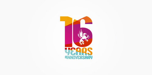
16 years anniversary of Studio Martin club.

Amber Garden logo

A strong, elegant, and secure logo!
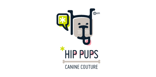
This fictitious company logo is the result of happenstance typographic exploration. I was playing around with H and I letterforms set in Platelet, and, after placing the I within the H, I noticed that it started to look like a dog face. After some modification, and with the addition of a curved P for an extended dog tongue, the resulting typographic illustration spelled "HIP." I thought it would be fun to name this fictitious company Hip Pups, which could be a shop that sells high-end dog accessories. The Registered symbol is integrated creatively into the mark by spelling "RUFF!"
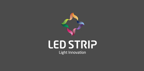
Client: Ledstrip Location : Israel Branding Agency: Bratus

mask


Cute little moose. For sale.
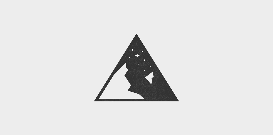
Minimalistic, contemporary logo concept for outdoor equipment company. Negative space forming mountains on clear night sky.