Highest rated logos
Most rated logos – Page 420
Unlock Your Creative Potential


A logo for lawn care service.

Security company in the United Kingdom offering services to high net worth individuals/ and companies. Rubus is the Latin name that Blackberries below to - hence the 'Blackberry' shape. This forms a shield, with the leaf/crown completing the logo.

This concept is based around a simple typographical focus on the RSSA acronym. The Society’s diverse scientific interests helped to form this visual approach, ie deliberately avoiding reference to any particular field with a recognisable visual. The intention was to provide a current day sensibility regarding identity design and construction, in combination with more traditional styling for a long established scientific body. To aid this desire, a modern serif was chosen as the primary font and a secondary sans serif for the tagline versions. These fonts were chosen as a combination for their ability to convey this future/past feel. The icon structure has the added effect of allowing the reading of ‘RS’ & ‘SA’ in either direction, and utilises the Society’s formation date within the design, as it adds historical weight and relevance, plus is also a small visual indicator regarding who and what the RSSA represents.

Need help with organizing your life? Your office? They specialize in getting you "put together!"

Sports marketing that specializes in highlight videos of students playing their sport. These videos are to be sent to recruiting coaches for colleges and sports teams.
Cloud-based business bookkeeping, accounting and tax preparation.
The official logo used for The National Federation of Professional Trainers.

iPhone Game Developers
custom type
http://www.facebook.com/yaceky

Dubai Internet City Logo

KM monogram, personal mark
Logo for my art & design studio.
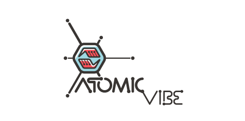
I define ATOMICvibe as the "a-HA!" moment of clarity in the creative process. Like nuclear fusion, it's when tiny ideas coalesce, and then explode into beautiful design.
The logo visually depicts this creative reaction. Forming abstract A & V shapes, the converging hands cradle the tiny beginnings of a big idea, fusing them until they discharge a shockwave of creativity. The custom type, designed to perfectly integrate with the mark, is meant to symbolize electron paths. Heavily inspired by retro imagery from the Atomic Age: science, the Space Race, Sputnik, the iconic George Nelson Ball Clock.
Click here to see the case study for this logo, which chronicles its development, and includes full design rationale, sketches, electronic roughs, and alternate designs.
My initials as a logo. Are any of my attempts any good?

Personal logo. My short name (:

Project for school. Fake brand of organic products. This was the one Ms. Teacher chose.

Experimental / concept work

...

...

Second version logo made for an Q&A website dedicated to women.
Just a modern, clean logo.
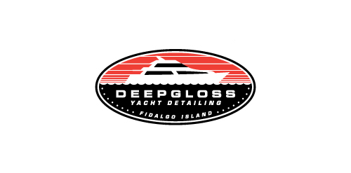
A yacht detailing business.

Branding for a recently completed project. Resiliency Insights is a start-up New Zealand based consulting firm. The client wanted to convey interconnections between three specific economies: 1) Primary economy (services and resources provided by nature) 2) Secondary economy (manufacturing industry and commercial services) 3) Tertiary economy (money and financial)

metric, Architecture Bureau
FORM Experimental / concept work