Highest rated logos
Most rated logos – Page 416
Simple logo of our client website


http://mikemark.com .Logo for a blog.

Logo representing tourism in Bulgaria - sun, sea, mountains.

daily feed personal blog

Real estate company for rental of commercial buildings
Logo design for Market Events, a corporate event planning organization.

The logo was designed for a Online Flower Shop. They will send flowers to your loved one directly to her/his house when you order online. This logo tries to reflect the freshness of the flowers and the products that "Kukyflor" offers. The typography of the logo was redesign to give the sensation of petals forming the word "kukyflor".

The logo depicts a cat of breed Sphynx. The logo is designed for various areas of business, in particular for kennel of the cats.
Abstract geometric symbol with custom logotype. Business intelligence.
IT Consulting Company located in Washington D.C. specializing in Virtualization, Network Design and Cyber Security

Pastelaria localizada em Coimbra, Portugal
Logo for Juan Tribe - inspired by origami / paper folds - the logo makes use of the Philippine colors - the logo resembles "Juan Tamad" who is a character in a famous Philippine folklore noteworthy for extreme laziness.

Logo design for a company that creates virtual 360° interactive panoramic brochures.

lasma

Logo for racing team
I designed this logo for a start up cocolate making company, the idea was to represent that everything is made out of chololates in the their factory..and its a dreamworld full of chocolate fountains and rivers etc.
The Anagenix corporate identity was inspired by phyllotaxis which is an arrangement of crisscrossing spirals found in nature. The visual of this concept and everything Anagenix stands for has an interesting parallel of how they combine science with nature through innovation and discovery. The circles contained in the shape symbolise their brand values – the many partnerships, the scientific discipline, their expertise and trustworthiness. The colour palette was inspired by its NZ origins and nature. Looking at the world through this scientific lens of the phyllotaxis this identity has been designed to behave like a chameleon by taking on the form of the medium it is put on. It may applied with varying images from the NZ landscape and the natural products that may be in the pipeline. It may also be diecut to suggest the explorative nature of their business.

Logo design for charity fund
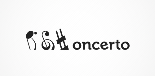
The concept is: subtraction. The name was created by leaving off the first letter of "concerto". So doing the same in the visuals was an obvious choice.
A logo for a new artist commerce community

halal day out

couldint be parve cacke

show horse center ring

test in motion