Highest rated logos
Most rated logos – Page 402

Client involved in design and programming. Beautiful designs and standard coding they do.


Freelance Graphic Design Logo
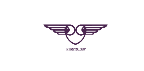
FIRSTSIGHT is fresh modern dynamic brand with short easy memorable name. It will suite well to any business or industry.
This is a logo created for a hospitality management company.

The symbol is inspired from the huge outdoor tent that is so characteristic of a Mela* or Fair. It depicts a colourful tent made up of arrows converging which stands for the exhibitors and the consumers who come from different areas to meet under one roof. (Mela means Fair in Hindi)

Logo - Fountain. Website http://www.ekran.in.ua/


A personal logo.

New Yarker is a fashion store located in Lima, Perú. They sell the worldwide fashion new trends for either girls or boys. The reference to the city of New York is very clear, the buildings contrast with the typography used. And the colors represent that this store is for youngsters that want to experiment the new worldwide trends in fashion.

Dog & Cat Grooming in France

A Work in progress logo for a Content Management System that helps teachers/schools. 'Schola' (Latin for School) + Organize = Scholarize. The symbol is a combination of an owl (represents wisdom) and a pencil (represents education)

Sailors' is beach cafe,, about the logo, dont try it at home if you dont want loose your glass :D

Minimalism design of three and could work well for any modern industry or business. Symbol is a metaphor of uprising, success, victory...
..known reverentially as "the great grandfather", may be as much as 300 years old, although experts estimate it is more likely 80-100 years old

logo for conditioner product

Handwritten logo.

The logo is an emblem of my three distinct cultural identities as a graphic designer: the head of a Chinese dragon, the body of an English lion and the tail of a Portuguese rooster. Born in a Portuguese colony in China where east meets west, I grew up in a richly diverse cultural background and have now lived in the English capital for more than ten years.

I was approached by new organisation 'Monitor Healthcare' to design their logo and brand identity.
Monitor Healthcare aim to provide people all around Africa with free medical advice via online and telephone methods. As this service is to be for the full continent I wanted to create a logo that would represent this unity.
The different colours of each section of the cross are representative of the North, East, South and West regions of Africa. The individual colours were picked based on the flags of the countries within each region.
The white cross in the middle of the logo is to symbalise the unity of the continent which Monitor Healthcare aim to provide.
environmental advice and projects

FOXET is fresh modern dynamic brand with short easy memorable name. It will suite well to any business or industry.
Greenosia
Green Devil
New logo for Webkolm web-agency. Webkolm is an Italian Web Agency based in Trentino. They develop website and other web stuff "into the wild". The agency is formed by three people: an UX Designer a Crazy Programmer and an Social Media Manager & SEO Specialist. Three different mind with different skills one identity. The old logo rapresent a "UI arrow" shaped like pine. The new logo mantain this elements but in a modern way thank to the "Impossible triangle structure" ispired to Escher works. The font is "The Sans" with a semi-serif that caracterize the K word.

This logo has been designed for a fitness club called "Tapesh". Tapesh in Persian means heartbeat. I used an image of a pulsation of heart combined with the name of the club.

Dance Marketing Group