Highest rated logos
Most rated logos – Page 389

Yahzy LLC is a NYC-based company that provides original compositions for films, TV commercials, concerts and corporate events. It also produces music tracks for singers (ranging from broadway, TV celebrities to indie musicians). The target audiences are film/TV industry, show business, as well as national/local musicians who seek quality original music that is tailored to their specific needs.


Mobile Convert is a young team specializing in creation of audio and video content distribution systems on the Internet, develop technical content, mobile applications, games, websites and content management systems. - - - - Logotype has a simple, readable form resulting from the simplification of the M letter and incorporated in it a universal symbol of "Play" clearly referring to the audio-visual character of the company. - - - Live on www.mobileconvert.pl - - Full ID here http://on.be.net/1HbaOBD - Follow us on www.fb.me/triptic.design

Concept intended for cheese merchant.

Sengottuvel Wood Carvings provides wooden products such as Wooden Statues and Wooden Sculptures. Mainly, offers a lot of variety of Hindu God statues such as Vinayagar, Buddha, Lakshmi, Saraswathi, Lord Siva, Murugan, Vishnu, etc.

Travel Pillow Review is a website dedicated to reviewing the best travel pillows available to help people make informed buying decisions. The logo was designed using Gotham Rounded. http://www.travelpillowreview.com/

The United States has a broken mental health care system that makes it challenging for patients to find affordable, dignified, and quality care.
La marca fué diseñada para un proyecto de Academia de Baile. Actualmente no está en uso pero se encuentra registrada para algún futuro emprendedor.
Logo for guest house Miss Depolo.

Gminna Biblioteka Publiczna im. M. Ćwiżewiczowej is a library established in 1929. It is located in Podhale, south Poland, region well known for its vivid folklore and deep respect for culture. The most common ornament embroidered on traditional clothing is the flower of carlina, which was the main inspiration for this design.
The idea for the logo came from an old saying:
"A book is like a garden carried in the pocket".
This product is a height quality horse bedding produced by the nature, the Swiss forests.

This logo was designed for e-shop something... for your home & living

This logo was designed for a dental clinic
Unused idea for a shopping centre
Online Medicine Store, for suppliers, for customers.

Logo for chimney sweeper.
Software and Servers

Logo for IT company.

Logo for e-pharmacy.
*
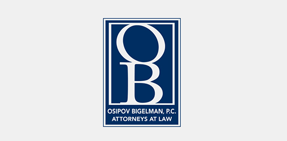
Dark blue and white color branding give this law firm's logo an elegant look. The OB monogram creates an easily recognizable symbol, while the text below it spells out Osipov Bigelman, P.C.'s full brand name.
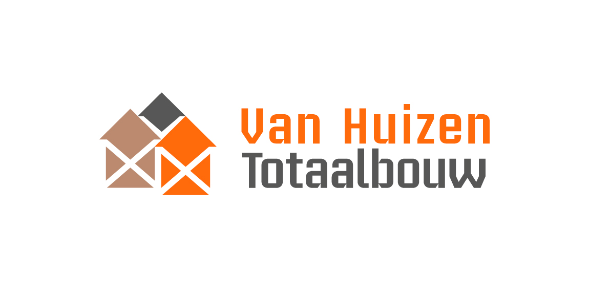
Building company. Their 3 pillars of work segment are 'Rebuild, renovate, installation'. Rebuild with concrete, grey color. Renovate with timber, brown color. Installation with copper, orange color. Scaffolding stands for building work in negative white. Houses stands for the name 'Huizen' Dutch for houses.
Logo is made of Pantone colors 1585C and CMYK 80K with an overlay of both for the brown color.
Logo in use at http://www.huizentotaalbouw.nl/.
KUKUKK Kollektiv from Berlin, Germany
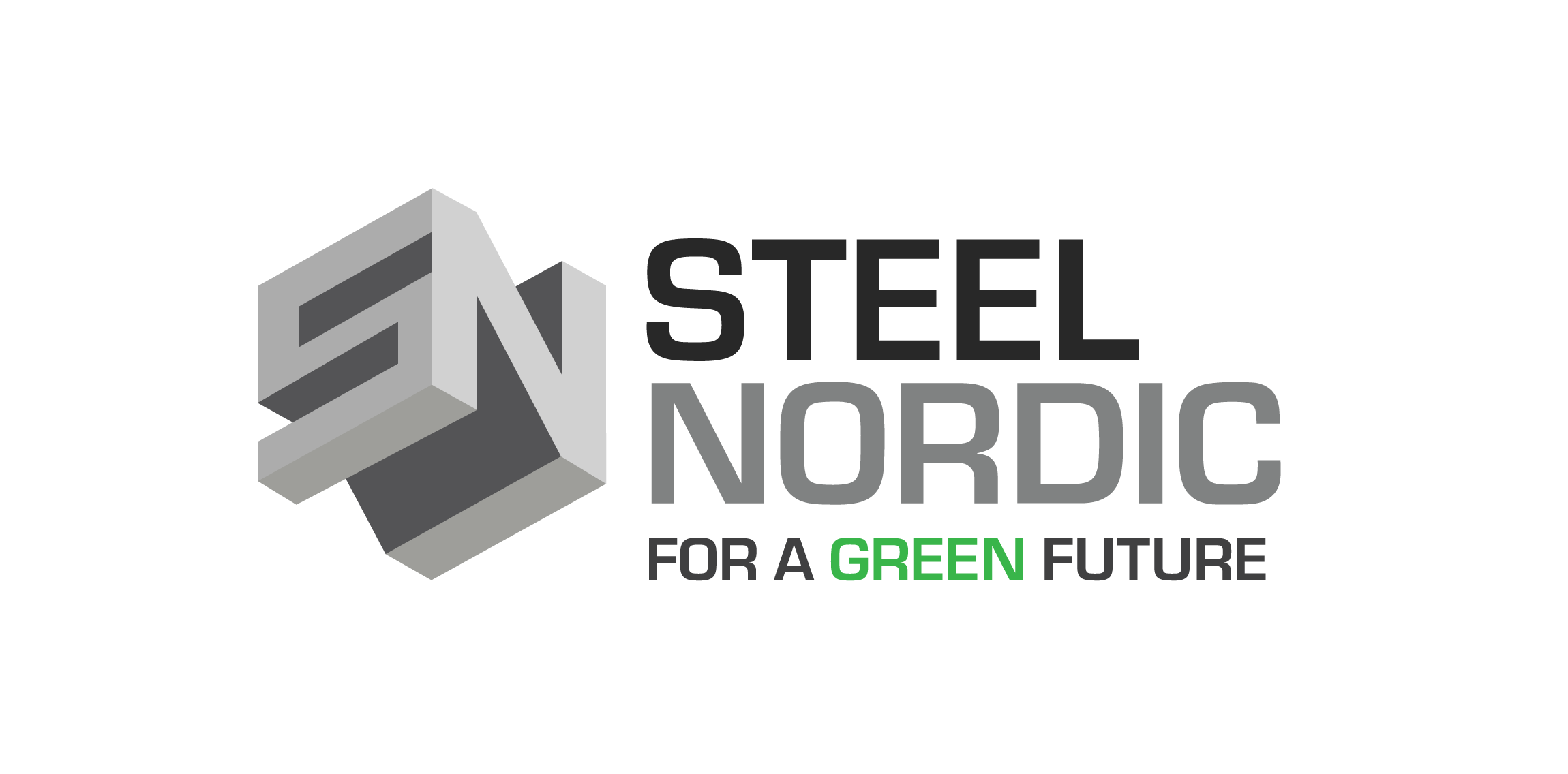
Logo design for Steel Nordic. Logo Designer: Tine Kaasgaard Tools: Adobe Illustrator Year: 2016 - ©Tine Kaasgaard // https://www.kyllyan.com/#portfolio

Logo design for a Dutch website that lists all day out trips from around the country. The logo is shaped by a foot and the outline of the Netherlands.