Highest rated logos
Most rated logos – Page 385
This logo was created as a personal brand mark for Geoff, to represent him as a graphic artist. This typographical solution was inspired by the 17th century Romaine du Roi, which features a serif face with its underlying structure. This mark was used previous to the Geoff Matheson Studio "G splat" and is no longer in use.


This logo was created for a collaborative social network project, Organism. The icon represents people networking together to create a larger network, and these networks working together - communicated through the graphic of gears made up of abstract people. Visit www.groworganism.com to learn more.
The new logo proposal for Monarch Bath Pvt. ltd. Monarch bath Pvt. Ltd. has various models active in the collections o f bathroom fittings and sanitary wares and regularly adds several new designs and brands to the product portfolio. The Company has also an exclusive range of sanitary ware to offer with a very wide choice in designer bathroom sets, wash basins, bathtubs and related items.

Work for interactive agency. Formiko means an ant in Esperanto. So it was a simple task - all Mootto had to do was to find an ant and draw it as close to the original model as possible. This is what an average ant in Mootto world looks like.

This logo successfully represents this land developing and civil engineering firm as a contemporary business with their eye on the future. The mark is inspired by a standard target tool used in their industries. Because the majority of W+A’s clients are from within these industries, this provides an excellent communication. The negative space from within the typography creates the “+” in the name, but also serves as a crosshair, as seen in the tools of their trade.
This logo was created as part of a rebranding project for ITMS. ITMS is a high-end lawn and plant care company that uses only 100% natural, organic products. With this new logo, they have a more reputable, professional appearance, as this design has helped them compete on a higher level. This design was inspired by the new ITMS tagline, "green plants, blue water" which is a symbolic, cause-and-effect statement. From this we created an iconic brand identity, that is optimistic and bright, appeals to the target demographic and is extremely versatile.

Nothing can rank higher
Marketing agency. Selected proposal. It turned out that the most important thing for the client was the impression of experience, seriousness, stability and ability to take on the most demanding jobs. Custom made lettering was a big part of why they have decided to go with this design.

Watch out for the killer gaming apps. Buy it on BrandStack.com

An IT company

Illustrative logo for a bakery

Online budget/financial management system.

Alerion is flag producer, the main idea of this logo is basic symbol of the flag contain the name of the brand.

The logo has two elements: "IQ=0" and "10=0"

very strong and static symbol, shape and color transmits security force and dynamism. Matter is a simple logo but with a high potential!
Design for GEC initiative

Internet Cafe
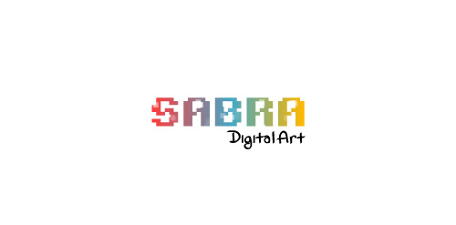
Sabra Digital Art

A looooney duck!

Wales YFC Brand by designdough
Isu Grand is a wholesale line of upholstery dedicated to provide quality and affordability to its clients. A line that has design origins in both French and Japanese styling, an isugrand sofa is the perfect transitional piece for your home.
new "skipping-rope" logo for http://skakanka.com.pl/
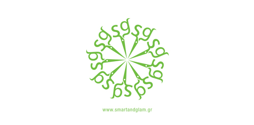
The inspiration of this logo was the scissors that the hairdresser uses to cut hair. The ends of the scissors are the initials of the salon's name "Smart & Glam". A round pattern of the scissors was made as a secondary element.

"Irini's House" is a group of appartments in Skiathos Island, Greece. The appartments combine impeccable services and a friendly, relaxed atmosphere with magnificent view to the Aegean Sea. The symbol created for this corporate identity is a fresh, colorful representation of the "Greek Summer Sun". Skiathos island is a very green, beautiful and cosmopolitan place to visit for your summer holidays..