Highest rated logos
Most rated logos – Page 382

Bohemian style jewelry designs.


Technical Consulting ( Web Development, Computer/Server/Network Consulting )

Last concept for Store More, a company offering cloud hosting, reseller, domain and ftp storage space services.

Logo for a local software and app development company.

Maryam Kamel Photography

investment & development
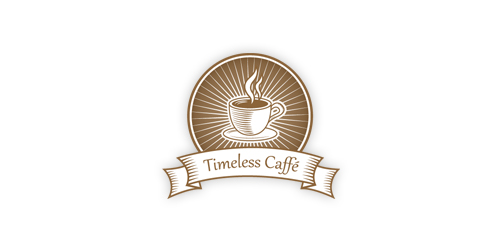
A perfect emblem for any retro/vintage caffe.

Typography

The Freedom is something you can not get it unless you are prepared to give him a gift for someone else. Clarification: http://www.behance.net/gallery/Freedom/2766123

Personal Logo For Mr.Joleed

logo for the new Russian social network for people who want to build a house
Logo for metalworking. Č.J. are name initials.
Redesign personal logo

Logo for Salon & Spa

KARELIA group is the importer of wood from Russia

new brand

Clothing for outdoor activities.

Logo for luxury fashion accessories made in France

Oli Deli specializes in a production of sweet delicate traditional tea cookies, biscuits and cakes made from the finest ingredients for any special occasion, as a gift or simply to make your day a little more special.

Graphic & Web Design mountains

BRAND LOGO DESIGN FOR A POLITIC DESIGN STUDIO Concept: the letter "A" with the text cloud refers to the simple & clean way that is needed to talk with another person. Color: we don´t identify with any color or any political party, that´s why we prefer t use the gray; that makes reference to the inteligence and also is an ellegant and sober color

...

Logo made for a casino management company.
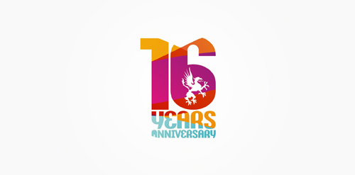
16 years anniversary of Studio Martin club.