Highest rated logos
Most rated logos – Page 337

Stone Throne, illustrates royal throne made of stone.


Design and Development Services

Second version
http://www.facebook.com/paulvonexcite

OVIDO is fresh modern dynamic brand with short easy memorable name. It will suite well to any business or industry.

Design of vodka bottle for manufacturer of glass packaging.

Blog about WordPress.

VICTORA is fresh modern dynamic brand with short easy memorable name. It will suite well to any business or industry.

Final logo of Pfeiffer Eventtechnik

WONIXO is fresh modern dynamic brand with short easy memorable name. It will suite well to any business or industry.

hotel

mobile app development company

BOBIXO is fresh modern dynamic brand with short easy memorable name. It will suite well to any business or industry.

media entertainment

Sound System's Logo

Privè Club's Logo

Logo for marine port

Custom typo for Old Regional Pub

Freebies for graphic designer

CRUXO is fresh modern dynamic brand with short easy memorable name. It will suite well to any business or industry.
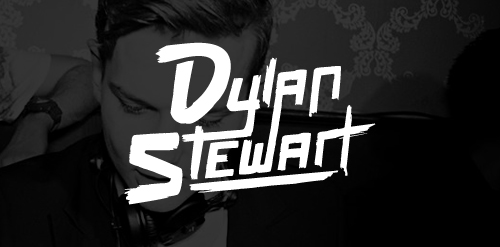
Custom Lettering logotype for DJ/Producer Dylan Stewart!

ZEAK is fresh modern dynamic brand with short easy memorable name. It will suite well to any business or industry.

The next in a series for this client. Short-run for caps, t-shirts, etc.

Another option for the series of logos made for short-runs on caps, t-shirts, etc.