Highest rated logos
Most rated logos – Page 294
新疆抓饭


Logo created for a cooking contest.

logo for a craft surface finishing company based in mexico.

logo for a clinical nutrition specialist based in mexico.
logo for a wood crafting products company based in mexico.
logo for a coffee shop based in mexico.
JUVENTUR logo od www.nlogo.pl
Logo for my daughter's piano/singing teacher ;)
logo Neuron

R Monogram

Logo for products will include baby toilet seats, bath mats, diaper bags and all other baby related bathroom products.
Steven Michael Signature
Personal Logo Design
this logo for engineer.
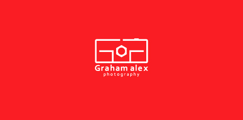
Graham Alex is a photographer and has recently opened his studio in Birmingham. He named his studio Graham Alex Photography. They hired me for branding their business. They want an identity that is creative and will be relative to their industry. I present four identity design concepts, they like the following one. In this logo camera represents, “photography” and GA are initials of” Graham Alex”. Camera and initials are merged to form a creative unique identity.

Fitness club "Fankas" rebranding
logo for a small architectural firm based in mexico.

Logo for mining industry located in Manitoba city (visualized with the map of Manitoba)
A rebrand of logo for a local vintage/hi-end furniture producer. The logo contains symbolic od "saw/teeth" and looks a bit luxurious also if you imagine the logo on the actual products. Which makes the brand and it´s product very special and original.
Book store
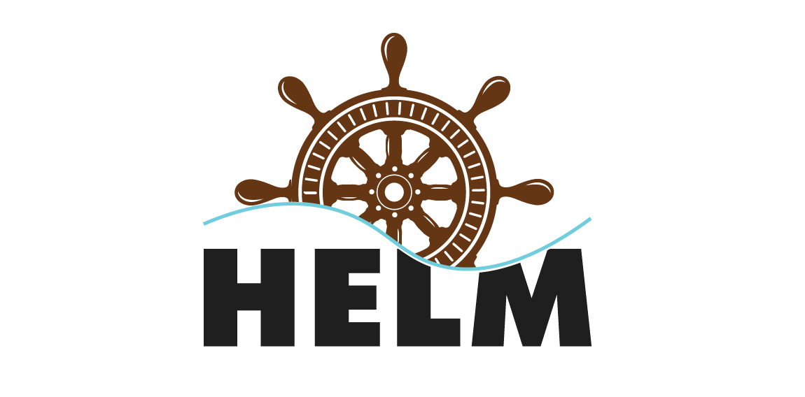
Logo for Helm

Inovation and different solutions for daily baby and mom lives.
logo for a jewelry-maker company based in mexico.
Logo for a Paragliding team from Venezuela