Highest rated logos
Most rated logos – Page 139

There's a boy inside "o" wearing a cap looking at the "b".


Logo designed for a blog that is aimed at parents to educate their childrens on natural health and wellness.

Strawberry Assurance is a consultancy firm specialising in risk assessments, security, installation and disaster recovery of IT systems and networks. The logo mark was constructed using triangular shapes to represent the 3 point process in which Strawberry Assurance operates: risk assessment, undertake required tasks to secure IT systems and provide in-house training to the organisation where applicable. The bold angular shape of the mark combined with a carefully selected logo type and colour palette provides the company a with a powerful and authority presence whilst remaining friendly and approachable.

Creative logo for funeral bureau

Just for fun

Kazakhstan, Almaty city, logo for citID.net
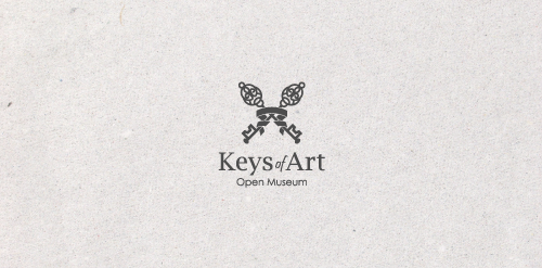
In the designer's words: An elegant logo infused with meaning. Functional both in the color version and in the version in black and white. Designed for galleries and museums open to all forms of art / Ideal for these industries: Art & Photography, Events, Design & Creative Services.

Logo for company that makes bespoke herbal remedies for a range of ailments, skin complaints and general well-being.
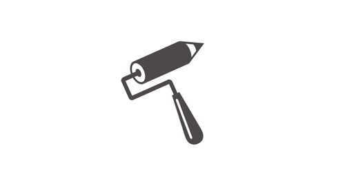
Logo for paiting company.
Logo design for the graphic design studio called 'nekarstudio'.
Created for fun only

Plug-in advertising logo.

"Vsya Posuda" means "All utensil" - on-line shop.

Perm Regional Library named after M. Gorky

Union Of Moscow Architects
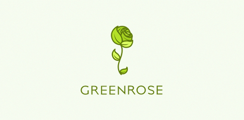
An eco friendly/fresh/green logo. Logos main accent is a green rose, that is made out of many leaves. Logo is still available.

For this logotype design, I had to deal with an a 14 years Yoga studio, called "Anima Soma" and refresh its appearance and Brand identity. After a lot of study on Yoga field and practice books, the source of inspiration for the logotype design was the classic yoga position and the Zen Stones. Design by Vasilis Magoulas / VAMADESIGN.COM
Lion Rock

Children's Bookstore

Reworking an unused concept.

Vanilla & Pepper is a company organizing all types of events, conferences, events and weddings.

Simple and strong logo for dog shelter.

Designer: Denis Aristov Client: Museum of Spoon Industry: Tourism, Culture Keywords: Museum, Spoon, House

Designer: Denis Aristov Client: Tentorium Industry: Beekeeping company Keywords: Beekeeping company, bee, stripes, honey, yellow