Highest rated logos
Most rated logos – Page 105

for a coffee bar deustation


Modern and simple logo. For sale.
Landscaping & Gardening
Logo for charity that supports local community with riding school. Also uses funding to rehabilite unwanted and abused horses. Based on old British tuppence coin with horse portrait.
Logo for beauty salon.

The Motor City Chop Shop logo features a flowing action, created with curved letters, lines and shapes. All of these elements combined create a raw, compelling feeling of a chopper in motion.

Logo for a creative agency. Letters C and U are combined into a paperclip which symbolize union and one of the tip of the paperclip is formed as a pencil - a symbol of creativity.

TELEPHONE
.

Logo for men elegant clothing line.

Swan (24)

agua

Egyptian style Doctor Bird concept.

FS monogram
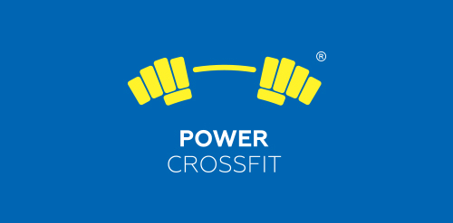
logo for GYM, combined dumbbell and fists.
Amazing logo perfect for bookshop or education. It is for sale.

Pizza

Bear Logo I made for software development and consultancy company.

Logo design for a a coffee bar.
Just for fun.
Logo for residential complex

Logo for a tour guide in Alexandria.
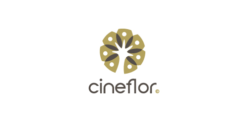
The 'cineflor' is made up of two words, 'cine' (root - kineo is an ancient Greek word, meaning 'to move' or 'stir up') and 'flor' ( root - latin word for the flower), e.g. energy healing, massage therapy, different types of creativity,etc.

Ready made logo.