Highest rated logos
Highest rated logos – Page 57
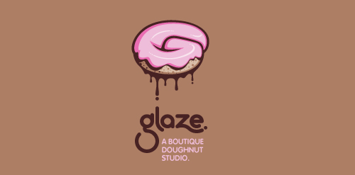
This is a totally fictional company that I refer to as "a boutique doughnut studio." I envision it as a trendy, metropolitan bakery that allows customers to glaze and decorate their own unique doughnuts. I wanted this to look really tactile, gooey, and sweet - like you really want to take a bite. Type for "glaze" is custom, and reflects the roundness of a doughnut. Click here to view my Flickr stream for full design rationale and additional images.


https://www.behance.net/gallery/23246927/Corporate-identity-Volga

Handmade wallets.
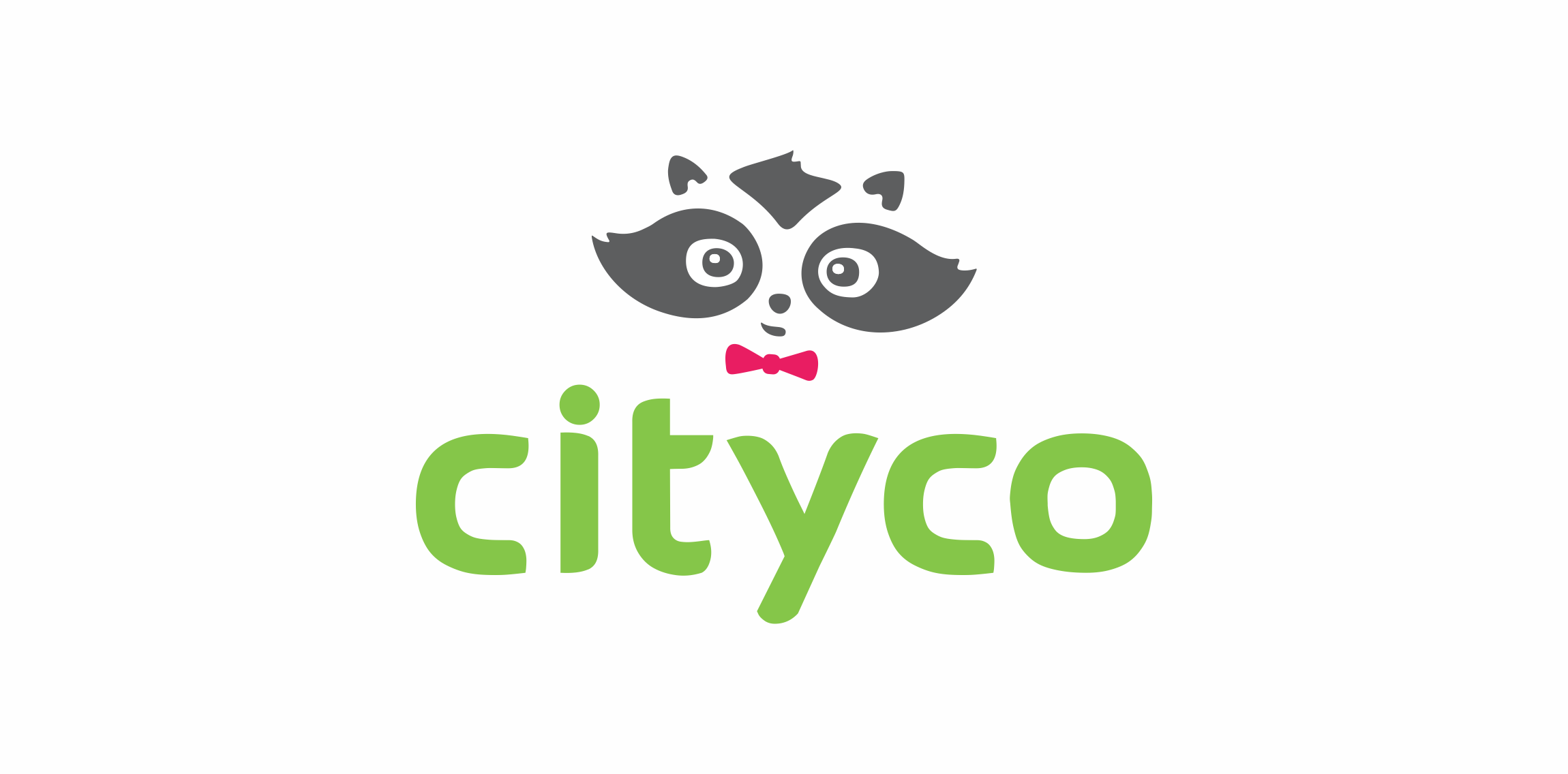
App for creating connected City using Bluetooth Low Energy
Logo for photographer.
grocery store concept


wakacyjnywynajem.pl mean holidayrental.pl. the company rental holiday destinations. main task was a combination of summer holidays and winter holidays. Turtle symbolizes the beaches, sand, lazy rest, cottage, bungalow (summer vacation), and by the crust styling to an igloo alludes on winter vacation.

... offers best-selling children books via a mobile phone/tablet. Unused proposal.
Bitrony - logo design. Based on custom typeface, B logo mark, bit technology and security.

Azenby are a specialist advisory firm within the mobile industry.

Organization of holidays (Cartoons)

Experimental / concept work showing a friendly astronaut character.

Brand/icon/logo for a mass mailer/email sender webpage or software.

a logo made for a it technology company from Poland - unused concept.

Exclusive Customizable Logo at Eisaks Logo Design.

Bulgarian Stock Company

Logo for downtown bistro.
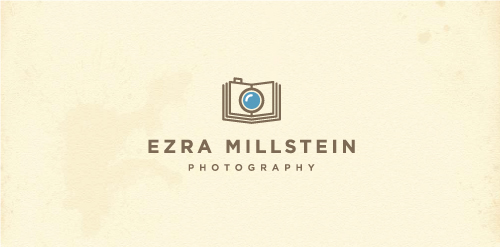
Logo design for Ezra Millstein, a professional freelance photographer and staff photographer for Habitat for Humanity International who likens himself as a “visual storyteller” hence the book/camera.

Logo for PerLove jeweler
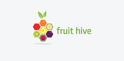
Logo concept for fruithive.com
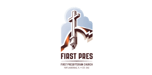
Redesign of the church's old logo in a stylized, illustrative manner, making it more welcoming, contemporary, friendly, casual, & upbeat. Client specified a rendering of the church’s architectural arch and cross in the perspective in this photo, and required an emphasis on the church's nickname, “First Pres."
Here, crisp, exacting vectors emphasize the architectural soundness of the church — a metaphor for the concept of faith as the solid foundation in one's life. This design makes use of hatching to add gradient dimensionality, enabling it to easily reduce down to 1-color. Colors are indicative of the building itself, including terracotta roof. Check my Flickr case study or Dribbble for more images, detail, and full design rationale.

Logo for protector company
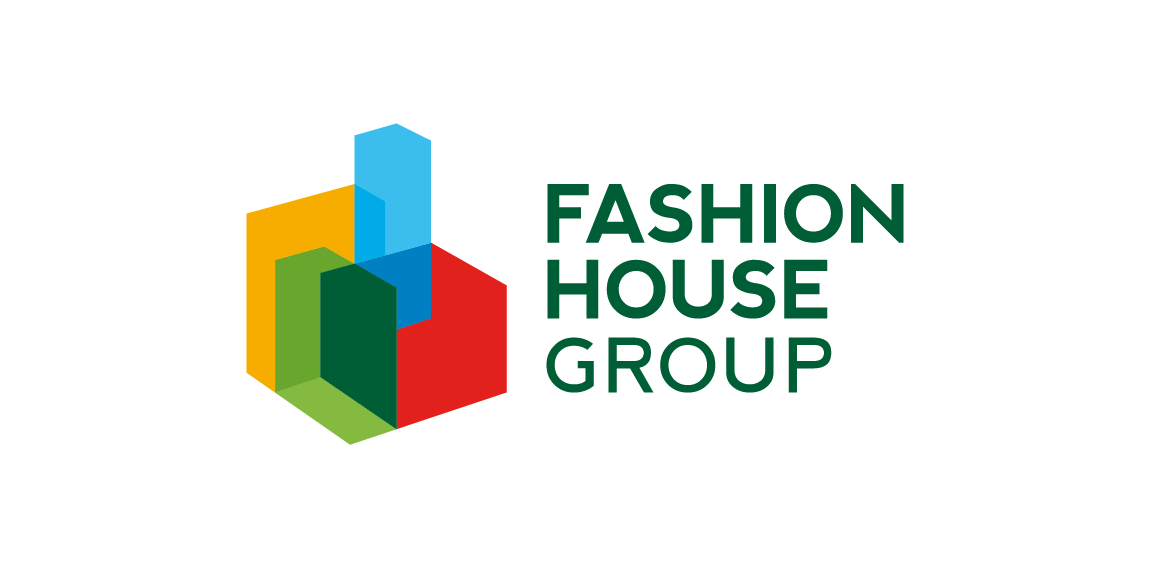
FASHION HOUSE Group is a developer and operator of fashion outlets from UK. A rebranding – the new logo was developed from a bold and surprising, albeit logical evolution of the old logomark. The abstract form of rising geometric solids invokes associations with both developer and operator activity of the Group. It references spatial dimension, development and growth. The colorful and multipart construction of the mark reflects the wide spectrum and multiple directions of FH Group’s activity. Graphic motifs derived from the mark’s structure form spectacular configurations to be used in layouts of publications and advertisements, while the colour palette allows building navigation with use of the colour code.