Highest rated logos
Highest rated logos – Page 56
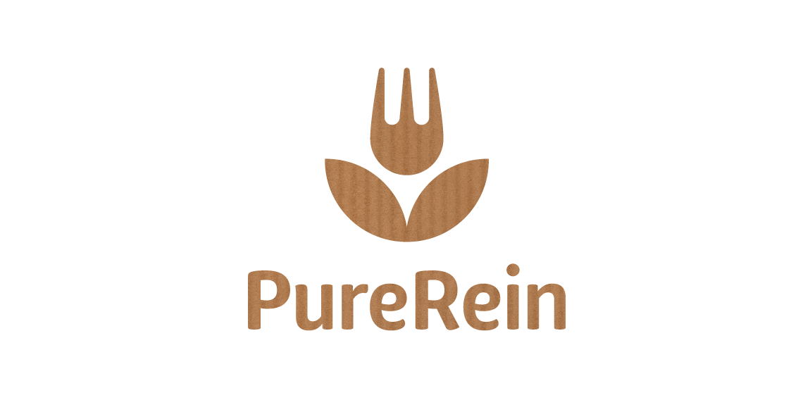
PureRein is a producer and distributor of healthy food Its founder, valuing the work of designers, like Polish logo design legend – Karol Śliwka – wished for a classically simple logomark. The created graphic combines symbols of a fork and a flower, representing food, nature and happiness. The fitting font is rounded, organic-like. Working with the Purerein brand consisted also of designing an extensive series of packaging with hand drawn illustrations of plants associated with the products.


School project "Teatr Lalek" means puppet theater

https://www.behance.net/gallery/30876225/CIRION La presente marca tiene como objetivo estratégico representar y comunicar mediante un conjunto de signos visuales, un grupo de ingenieros dedicados al desarrollo de productos y servicios electrónicos. Transmitiendo formalidad, responsabilidad, calidad y continuidad
App for creating connected City using Bluetooth Low Energy

An icon for a bakery.

It`s a Riga, Latvia based company called "Russian Up!". The main idea behind - it is company providing russian language courses for foreigners (people from UK, Germany, USA).

Organization of holidays (Cartoons)

Logo created for an audiology office in San Antonio, Texas. The shape of the logo represents sound waves.
Makeup Studio

Logo proposal for a foundation that supports problems with legs.

Handwritten logo.
Simple and modern logo.


Swan (24)
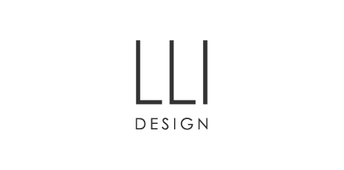
Logo for luxury London based interior design consultancy LLI Design
Hospital

COMBOX is fresh modern dynamic brand with short easy memorable name. It will suite well to any business or industry.

House creativity

Bluefire

Catering and Events company

Company sphere of activity is medical equipment and services.

logo for a small architectural firm based in mexico.

Footy 7s
clocks and watches / 2010 / student work