
Highest rated logos
Highest rated logos · Page 54

"Raízes" ("Roots" in English) is a segment for training and distribution of products and services based on Multi-Level Marketing. The name was chosen due to the characteristics of biological functioning of the body's most important tree: the root, the stem laying on the ground and transports nutrients for their survival. These are also the characteristics of this segment: fix market, providing ways of working and bring products from their suppliers to the attention of the population, as a large tree attached to the ground, beyond that required for the ecosystem, offers plenty fresh who are in need.


fun, country gal style.

"Truit" is a company that deals with the distribution of transparent displays.

Logo for english language school. More on behance: http://www.behance.net/gallery/Extra-English-language-school/8600383

.

logo for a ngo based in mexico.

Logo design for Challenge Day 2014, Hungary

The vision through a human eye experiencing fun and colorful experiences. Logo design for a mobile app company, with a focus on creating augmented reality.

Logo for housing investment.

Moon river, wider than a mile I'm crossing you in style some day Oh, dream maker, you heart breaker Wherever you're going, I'm going your way..

This logo was designed for e-shop something... for your home & living

You Should Recognize Your F--king Sins

Geometric logo
Logo for Logo para linha de produtos alimentícios japoneses.. Logo para linha de produtos alimentícios japoneses.

logo for the portal with job offers

http://www.facebook.com/yaceky


Unused proposal for vintage women clothing.
Logo for a hotel or a local business

lasma

logo created for a family company based in mexico.
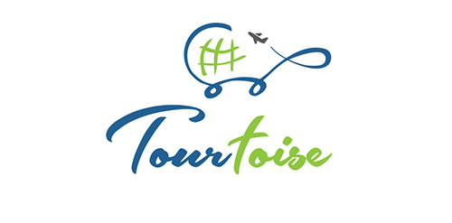
Unwanted proposal for: Travel studio with a THEME-based Travel Experiences of a lifetime. These tours are niche escorted journeys around the world. The studio conduct Land journeys, Cruises, Package tours, Vacation travel, Education tours, etc. most of these tours are exploratory tours.

Forjando Diamantes (Forging Diamonds, in English) is an educational organization dedicated to strengthening and developing personnel for entry or qualification in Multi Level Marketing. The brand name was already included in the Briefing, which is why I had to focus on creating an image that represented the ideals of the business and the literalness of his denomination.
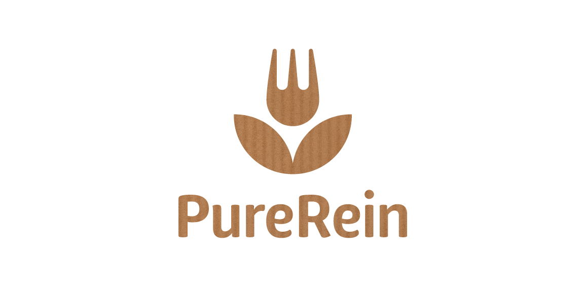
PureRein is a producer and distributor of healthy food Its founder, valuing the work of designers, like Polish logo design legend – Karol Śliwka – wished for a classically simple logomark. The created graphic combines symbols of a fork and a flower, representing food, nature and happiness. The fitting font is rounded, organic-like. Working with the Purerein brand consisted also of designing an extensive series of packaging with hand drawn illustrations of plants associated with the products.