Highest rated logos
Highest rated logos – Page 48
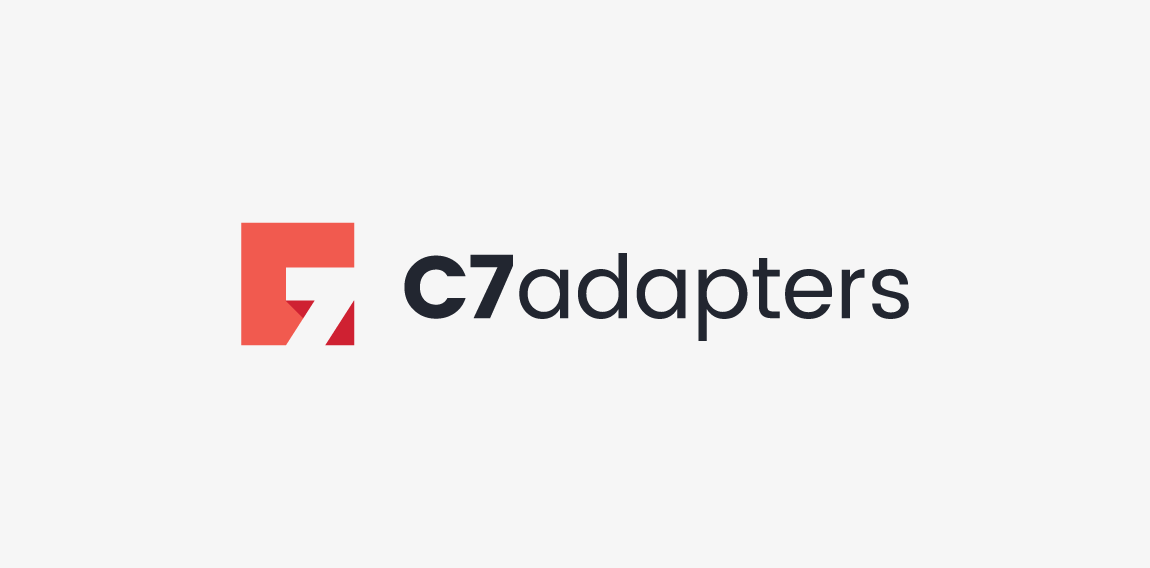
Logotype created for company manufacturing specialized adapters for photo & movie cameras. The logo is a combination of "C" letter and "7" in negative space. • • • Created for Motyf Studio • • • follow us on www.instagram.com/triptic.pl


https://www.behance.net/gallery/23246927/Corporate-identity-Volga

Logo for online shop with clothes and accessories for kids
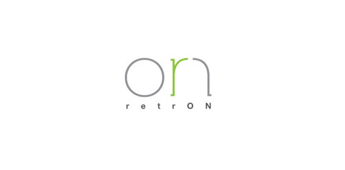
Combining the the letter of "r" and "on". Client really care the on to appear to their logo so that using the ON instead of the main visual.

Group of energy equipment manufacturers
Playing with name & letters.

music social network. second concept

Caprese it's a small Italian Restaurant in my city. They main color was blue, so i;ve decided to connect fresh blue color with small gold elements.

Concept intended for cheese merchant.
Logo designed for a luxury car shop.

Experimental / concept work showing a friendly astronaut character.

Logo for a Dutch wijn forum called Experts in Wijn where people talk about wine: Experts in Wijn

logo for a consultancy, meaning a part of the network, as well the logo is having some free mason symbols

The Shopping Online Logo

soccer crest design

Guillotine concept typo
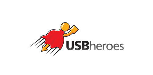
Here is USB superhero!
This is just my idea which came into life at last.
Logo is perfect for any kind of business related to USB devices,flash drives etc.
New logo for Webkolm web-agency. Webkolm is an Italian Web Agency based in Trentino. They develop website and other web stuff "into the wild". The agency is formed by three people: an UX Designer a Crazy Programmer and an Social Media Manager & SEO Specialist. Three different mind with different skills one identity. The old logo rapresent a "UI arrow" shaped like pine. The new logo mantain this elements but in a modern way thank to the "Impossible triangle structure" ispired to Escher works. The font is "The Sans" with a semi-serif that caracterize the K word.

The Motor City Chop Shop logo features a flowing action, created with curved letters, lines and shapes. All of these elements combined create a raw, compelling feeling of a chopper in motion.

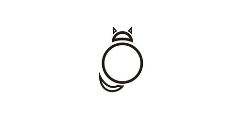
Foxography


Dukat - luxury gold jewellery