Highest rated logos
Highest rated logos – Page 422
Urban Jungle was hired to develop Liv’s brand strategy, including its tagline and brand story. After clarifying its vision and defining its mission, values, personality, promise, experience, Urban Jungle then crafted the new corporate identity for the firm. The new look is simple, bold, and contemporary. It captures the essence of the firm’s fun and friendly personality while communicating its promise to help Edmontonians love where they live.


Tech logo

Logo for NeoDieta
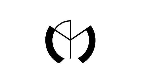
This logo illustrates the simplicity and mysteriousness of the Mysterious Marketer. The 2 squares the M, but it is also actually a question mark.

Logo design with smile. We wanted to show the company in a smile face. // projekt logotypu dla krakowskiej firmy - centrum stomatologicznego bettersmile. Chcieliśmy pokazać gabinety na zasadzie przyjemnego skojarzenia z uśmiechem. Sama nazwa również naprowadza na tego typu reflekse, stąd pomysł aby wykorzystać krzywą ułożoną w uśmiech. Kolorystyka narzucona - to jednak bardzo dobrze pasuje do niestandardowości całego pomysłu na projekt logotypu.
NII - The logo design project for a freelancer group who develop and implement the application on iOS. NII not only means "Nothing Is Impossible" but also is their criterion.

logo for company drums.lt

This was presented in the initial meeting but was rejected in favor of the Crown word mark logo.

以空格符號表現“空無所有·無所不有"的設計理念。
A logo created for a company called 'Think' they are experts in communications for PR, corporate communication and content creation


The Food and Beverage Association of America is dedicated to promoting and advancing friendly relations between members, encouraging continuing education, assisting in career growth, providing industry-related scholarships, and providing philanthropic support for critical social issues.

Rough draft version of a logo for an Indian restaurant
This logo is for sale. 1. Fully editable eps and ai file. 2. Lifetime Customer Logo Support. 3. Free revisions. ie; name, color, background and other minor details. Buy it here: Quick and easy! More info? email me: ricky.laurente@gmail.com Thanks!

Hend restaurant

A Logo used for a dating Agency.

Logo design by http://www.dannyglix.com/logosandbranding.htm

Resaltamos el propio nombre de la marca mediante un concepto que parte de la orquídea, la cual representa la sexualidad y virilidad, fusionado con el órgano reproductor femenino, con la finalidad de enfocar a la marca como una alternativa hacia las parejas para llegar al acto sexual. La sutileza de las curvas en la orquídea con la abertura en la parte central evidencia el deseo carnal.

safety doors
I created this identity by integrating my name initial A and M (Amrita Mayuri), which reflect my personality.