Highest rated logos
Highest rated logos – Page 418

exceptional


Sinverb - creative thinking (blue icon and blue dot) and sharing (icon = arrows and negative space where inside is letter S for sinverb/sharing)

Web Design Studio

The logo has two elements: "IQ=0" and "10=0"

Reservation of rooms in hotels.
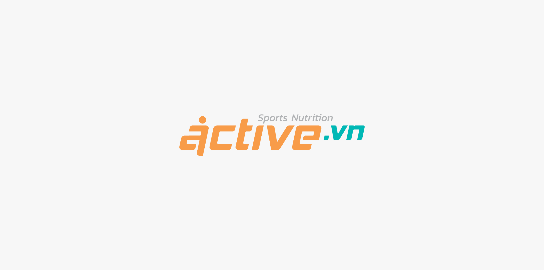
Active Vietnam

PCP
We created a logo that present a proud figure of Polish hussars rider. Due to the purpose of the logo, which is related to embroidering it on clothes, we focused on minimalism. The logotype has been presented only the most characteristic elements of the hussars or a horse and a helmet with wings. Thanks to that we avoided the splendor that disturb the brand communication with the client.

fishair logo/mark

concept work
Buffalo Dining Club is a new concept bar from the team that brought us Table for 20 and Sticky. It centres on good produce, good service and good times. The identity created takes cues from mid 20th century diner-style brands and typography as well as drawing inspiration from classic Americana.

Graphic & Web Design mountains

DNA Job - talent management and e-learning

Logo for Salon & Spa

Logo for new consulting company - Sekhmet Consulting

Share and spread anything around you and your area.

logo for a graphic designer check out the full project on behance https://www.behance.net/gallery/33027157/My-brand-identity
Redesign personal logo

logo for a creative agency
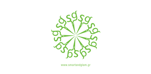
The inspiration of this logo was the scissors that the hairdresser uses to cut hair. The ends of the scissors are the initials of the salon's name "Smart & Glam". A round pattern of the scissors was made as a secondary element.

Post Master— A package delivery company providing specialized transportation and logistics services.

EvaSecret | Lingerie online store

This is a tree on which there are biscuits in the shape of a heart. http://ekran.in.ua/

Marketing agency. One of initial proposals presented to the client. Marketing - barcode. Would be very interesting to develop into a full-blown identity - this barcode idea seems to possess quite a potential for various applications...