Highest rated logos
Highest rated logos – Page 362

Logo for Slovenian nature/landscape park Rački ribniki, where you can find lakes and ducks.


Approved logodesign for Realtyweb.com Custom made Typography. RealtyWeb.com combines 3rd party data and information on close to 30,000 state and local real estate markets to help the consumer and the real estate professional make educated decisions.
Logo for a local Kansas City artist and photographer.
A logo concept for online store of personalized t-shirts.
Custom hand made family fashion for children and their parents. Pulcino means "little chicken" in Italy.

Game 360

oft flowing and airy lines create the impression of a running fox animal. The fox is designed with streaming lines, which create the feeling of the wind blowing as well as the running movement of a fast fox running through the lush forest. Leaf elements are naturally placed throughout the design to add a natural flair to this unique and elegant fox logo. https://www.logomood.com/downloads/windy-fox/

Information and Consulting group


Logo for NowyFolder. It shows: something new (nowy=new).

logo concept for a new age consultant group

Design for an eatery/cafe with new age, vegan & organic menu. Although not exclusively, children/young adults are a target market.
Bridge Logo Design Template. You can use it your company logo. it's vector format so you can scale it and also change it's color. print and web media also.

The logo idea for a company, which deals with business tourism in China, providing logistics services, assistance in finding suppliers and cargo declaration.
Logo name is combination of two words, Medical and shield. Logo is designed for any medical college, hospital, clinic, medicine brand or any thing relating to health or medicines. For sale: http://brandcrowd.com/logo-design/details/108779

ixune is a tech startup currently under development that will help fuel your passions and provide you with a vehicle for self-actualized success. ixune.co
A local landscape design small business located in Canberra, Australia.
Medsolver is a psychological and psychiatric clinic based in Łódź/Poland. Logotype is a part of ID which we have done. - - - Made for Motyf Studio. - - Live on www.medsolver.pl - Follow us on www.fb.me/triptic.design

aarto is a small architecture design studio based in Warsaw/Poland. The aim was to diffirentiate 3 areas of expertise: Architecture - Urban planning - Interior design. We wanted to keep it simple and modern.

A design concept of the logo for a young and ambitious company that specializes in providing consulting services in the field of software developed by leading Russian developer of information systems, the company "1C".
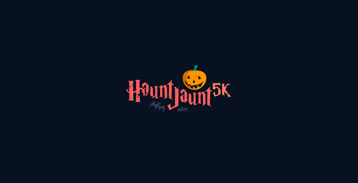
Haunt Jaunt 5k Halloween event logo
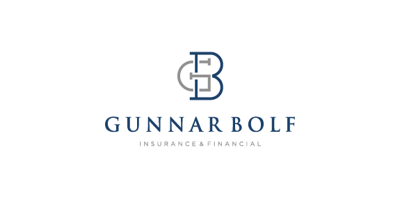
GunnarBolf - Client work, For more, Check the full project in behance. https://www.behance.net/gallery/45110843/Gunnar-Bolf-Identity-design

The landscape gardeners build as much as they plant, summed up in a marque made of both a garden trowel and leaf.

Money Car Lease Poland - money for cars ;)