
Highest rated logos
Highest rated logos · Page 36
CrossFit


Logo for a company in exotic handmade fabrics

Conceptual logo. Logomark represents idea,inspiration,farm,sunshine and growth.

on-line jewellery store
Applicable for multimedia and creative designs such as three dimensional movies. Also for computer graphic application and game developing application.

The intellectual role-playing games club


Unfinished project for a technology company.

Logo for fun , you can read the word means growth in arabic "نمو"

Advertising agency.

Logo for Good Taste Festival - Polish nationwide culinary contest for restaurants.
Logo designed for an artificial grass company

Logo for importer of alcoholic beverages

logo for a real estate company based in mexico.

Ecotourism in Ukraine, Crimea.

FITMAN, Body Shaping Centres for Men
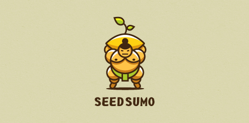
"We are a mentorship-driven seed accelerator. We look at hundreds of Startups a year and only choose 10 that we give $20,000 in funding (seed) drown them with mentors and advice and prepare them to pitch their startup to dozens of investors to take them to the big leagues (sumo). " Unused proposal

Based in Denver, Colorado, Tenacious Landscaping is involved in projects ranging from town to country gardens, and uses both traditional and contemporary styles. Our design work for the Tenacious Landscaping brand coincided with a revised content and monetisation strategy. So we chose the wild beauty of the bighorn sheep, the State animal of Colorado for this vibrant company’s brand identity. Boasting horns that can weigh up to 14kg and an intrinsic part of Native American mythology, this animal captures the spirit of Colorado wildlife and reflects Tenacious Landscaping’s brand values of power and elegance.

First class brand. For sale.
Warhol Nightclub logo proposal.

....

logo idea with king
The Ocean Palace Luxury Resort logo features a minimal black and white color palette to keep the focus on its intricate symbol, which bears a crown in the middle to imply luxury.
A rebrand of logo for a local vintage/hi-end furniture producer. The logo contains symbolic od "saw/teeth" and looks a bit luxurious also if you imagine the logo on the actual products. Which makes the brand and it´s product very special and original.