Highest rated logos
Highest rated logos – Page 336


for fun

Dumma Branding is the design house of Duminda Perera. Duminda is currently involved in an ongoing logo project for design every day one Original, Clever, Wordmark/Verbicons or Negative logo.

As its name suggested, (Noah’s Ark where the animals were sheltered and protected from the big storm), This cafe in Ipoh is giving free foods to street ministry, and the profit will goes to children home as well. Logo designed based on noah's ark which i have twisted the sheltered on the ark to coffee cup. And there are cow, goat, chicken played around the negative space. Which is to strengthen the meaning of the logo name.
This product is a height quality horse bedding produced by the nature, the Swiss forests.

logo for jewelry designer

Primocafe Gourmet Restaurant in Italy, Rome
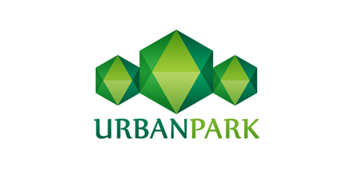
Urban Park logo concept


Exclusive Customizable Logo at Eisaks Logo Design.

platform for trading

50Kapel' (50Drops) | Alcohol internet store

"Irini's House" is a group of appartments in Skiathos Island, Greece. The appartments combine impeccable services and a friendly, relaxed atmosphere with magnificent view to the Aegean Sea. The symbol created for this corporate identity is a fresh, colorful representation of the "Greek Summer Sun". Skiathos island is a very green, beautiful and cosmopolitan place to visit for your summer holidays..
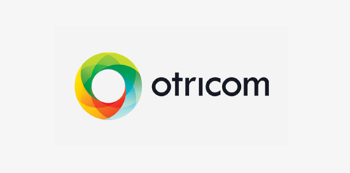
Custom logo design I did for Otricom in 2012.

Internet Cafe
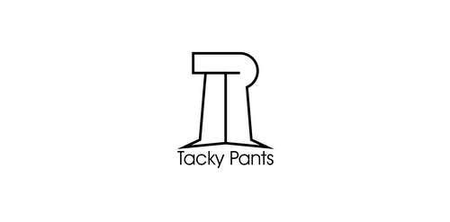
Logo designed for tacky pants

Sklad Si.voda (Si.Water Fund), an institute for pure and healthy water (established by Si.mobil)

TRAK Foundation is a non profit organization comprised of members who raise money for children's charities through athletic and social events.

"Piano Smile" is a fun, illustrative and clean logo depicting a funny face with a big smile in shape of a piano keyboard.

MINIXO is fresh modern dynamic brand with short easy memorable name. It will suite well to any business or industry.

Logo for a local software and app development company.

logo design for a sales and lettings agent.