Highest rated logos
Highest rated logos – Page 330

Logo design for "FITTLE" - fittle.me This logo idea presents dual meaning - HEART and CHECK MARK symbol. The logo presents the joy of healthy achievements and exciting lifestyle. "FITTLE" aims to bring together health professionals and clients from around Australia.


Logo design for non-profit organization.The logo was inspired from mothers around the world and affection and love for their children.I just tried to communicate that feeling with this design

When you are gone, me too
Logo for That's Com, advertising and communication agency based in Italy.

Pastelaria localizada em Coimbra, Portugal

...

Logo for a restaurant that serves only healthy food.

Pendo started as a webdevelopment company trying to be of big value to its customers. Pendo is Latin for 'value', the meaing behind the name is that the idea of the client together with our solution creates a better/stronger result (more valueable).
Because we started as webdevelopment company the logo exists of two brackets < and >, these two combined create a stronger (more valueable) link.
The color is not final yet, I'm thinking of using a slightly darker and more blueish color in the final version.

Blog about WordPress.

Issue of loans online. Quick and easy! "Lightfin" - a derivative of the "light finance". See all project here: http://www.behance.net/gallery/Lightfin/11482207


Dumma Branding is the design house of Duminda Perera. Duminda is currently involved in an ongoing logo project for design every day one Original, Clever, Wordmark/Verbicons or Negative logo.

Trade of special machines like a autoloaders.

...

Hairdresser Logo

Logo for a bespoke hand-maker of exceptional modern furniture.. just for fun :)


Logo for company organizing sports events. Mainly engaged in the organization of running, triathlons, crosses and trails races.
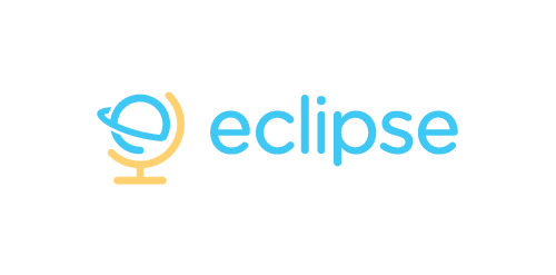
Eclipse offer specialist training software - mostly linguistic, but also teachings on grammar, syntax, etc. The use of the globe device reinforces the idea that language & communication is a ‘global’ exercise. Conceptually the design is of course inspired by a globe on its axis/stand. Since the idea of the eclipse is not necessary representative of solar or lunar, the mark focuses on how eclipses are created, orbit – The precise moment the Earth/Moon orbit is in relation to the Sun. The planet also forming an abstract E, creating a subtle monogram.
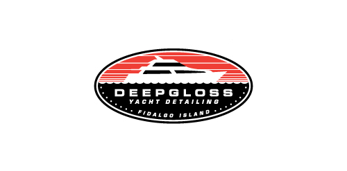
A yacht detailing business.
Fitted the H and J in a logo, using negative space