Highest rated logos
Highest rated logos – Page 33
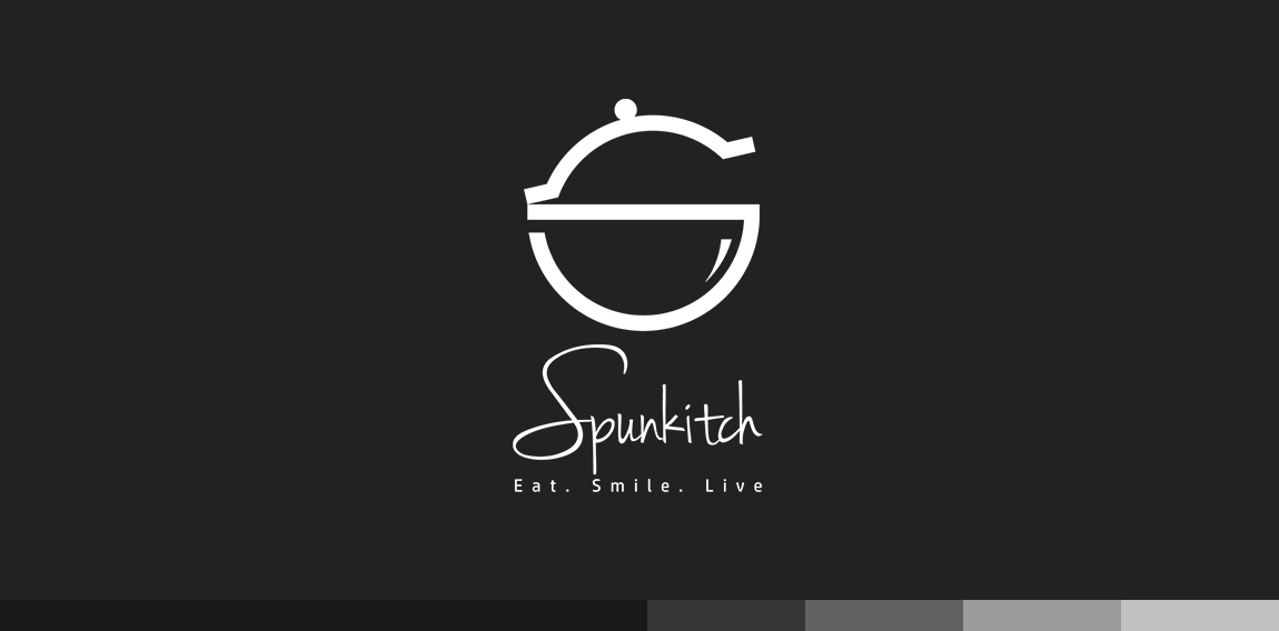
S + Pot + Bowl


Handwritten logo.

Just a conceptual logo.

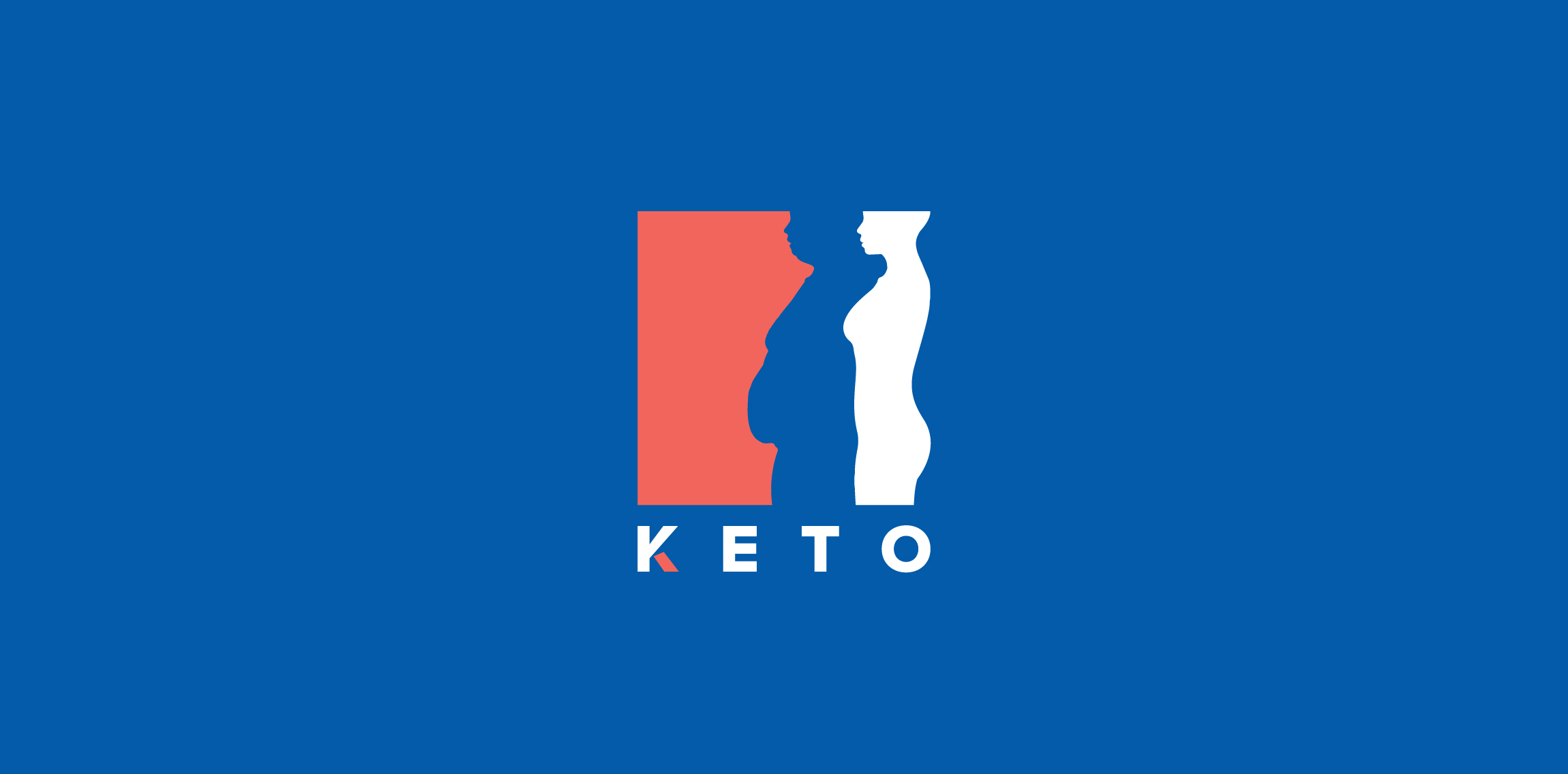
Keto
Logo for luxury London based interior design consultancy LLI Design
Logo for a belgian restaurant between 2 and 3 star segment.
I like cats. :) Just for fun.

Bluefire
Branding logo for my Industrial Design portfolio

Catering and Events company

unused logo

Company sphere of activity is medical equipment and services.

Papa is a little coffee shop in Ho Chi Minh City, owned by Vietnamese family siblings. Papa means “father”, so the interiors are inspired by their father’s familiar items and they also bring his favorite flavour into Papa’s drinks, which is their pride. Besides that, raw materials are carefully selected from Dalat, where fruits are fresh all year around. Papa’s logo shape is the image combination of their father’s top hat, his beard and a cup of coffee. More at: www.behance.net/gallery/35121837/Papa-Coffee-and-Furniture

School project "Teatr Lalek" means puppet theater

An icon for a bakery.

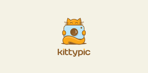
logo for photo company

Тачскрин меню

It`s a Riga, Latvia based company called "Russian Up!". The main idea behind - it is company providing russian language courses for foreigners (people from UK, Germany, USA).

Xperity is a Dutch agency specializing in Microsoft Dynamics 365 and CRM for businesses.

An idea which was not used.

rabbit wordmark/nounicon

I created this design for a very well-known clothing company.

A modern logo suitable for several businesses: mining and geological supplies, data analysis, creative studios, landscape designs. Logo for sale on BrandCrowd.