Highest rated logos
Highest rated logos – Page 319

3D Architecture Visualization company


Genius Vibe

fail stuff cought on camera (some streaming videos for fail clip)

...

Logo design for power grid company.

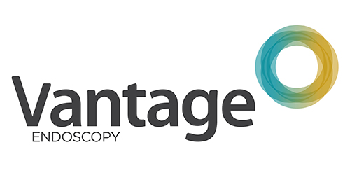
Inspired by the Spirograph, Urban Jungle designed the identity using a combination of four semi-transparent aqua and ochre circles. The circles symbolize the convergence of two unique corporate entities into one new corporate brand identity — Vantage. Using charcoal for the typeface, the identity blends a vibrant colour palette giving it a fresh, smart and energetic feel, and reflects the youthful and contemporary edge of the company.

Prince's Foundation for perfumes and cosmetics
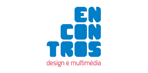
[see more in behance @ http://bit.ly/W8GJLS] Encontros Design e Multimédia is an event. It has being taken place since 2009 and consists in a week dedicated to promote and develop design and multimedia activities, workshops and meetings in the city of Braga. It's promoted by Escola Profissional de Braga. The design, organisation and communication of the event is the responsibility of a finalist student. [The brief] Encontros Design e Multimédia had a clear ambition, grow year after year, it wanted to inspire, involve and thrill the students, professionals and enthusiasts about Design and Multimedia. The logo was to be used in the website, facebook, promotional material, including posters, flyers, video, and a lot more. The goal couldn't be clearer, it had to be unusual. [The solution] The logo represents Encontros's strong ambition. It has all the elements to succeed, it's simple, relevant, it incorporates tradition, it's distinct, memorable, versatile and it stands out from the crowd. It's designed to be filled. Filled with photos, images, participants, speakers, filled with design and multimedia. It has no icons of design or multimedia and doesn't need them, it has all the qualities of both and all the creativity to be anything. [Typography] Encontros has a unique typeface, its custom and it's designed specifically for this brand. It's a bold geometric typeface designed to be filled and to get noticed in every contexts. [Colors] The colors are one of the most important elements of Encontros. The chromatic scheme is very expressive, it's a variation of the well known CMYK, providing a vast number of combinations making the brand very dynamic and inspiring as well. [see more in behance @ http://bit.ly/W8GJLS] [joserodrigues @ http://be.net/joserodrigues]

New Branding was developed to increase recognition and reputability. Being a small Accounting Firm, Sandra wanted something fun that her customers could identify with (Bringing in a show box of expenses).

http://wp.me/s4571j-altegro

an establishment providing women amn men with services to improve their beauty, such as hairdressing, manicuring, facial treatment, and massage


for fun

As its name suggested, (Noah’s Ark where the animals were sheltered and protected from the big storm), This cafe in Ipoh is giving free foods to street ministry, and the profit will goes to children home as well. Logo designed based on noah's ark which i have twisted the sheltered on the ark to coffee cup. And there are cow, goat, chicken played around the negative space. Which is to strengthen the meaning of the logo name.

Issue of loans online. Quick and easy! "Lightfin" - a derivative of the "light finance". See all project here: http://www.behance.net/gallery/Lightfin/11482207
This logo depicts a box without a top. It's symbolic of the ineffectiveness of services offered to homeless across the USA.

Angel-Frozen yogurt


Dumma Branding is the design house of Duminda Perera. Duminda is currently involved in an ongoing logo project for design every day one Original, Clever, Wordmark/Verbicons or Negative logo.
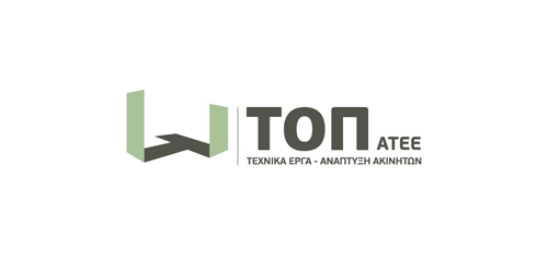
The inspiration of the identity of this construction company was the actual foundations of a building under construction.
A 3-dimentional symbol was created based on letter “T” (The initial letter of the company’s name) as the base of the construction, expressing the company’s values, such as trust, accuracy and professionalism.
A round logo with the letter Z incorporated. Can be used for any type of business or service. Want to buy it? This logo is for sale at suitablelogos.com
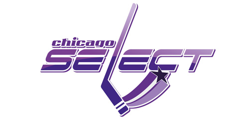
Unused proposition in contest for chicago hockey team

A logo for a wedding planners