Highest rated logos
Highest rated logos – Page 27
Logos and Marks 2018 | Part 06 : https://www.behance.net/gallery/62866383/Logos-and-Marks-2018-Part-06


Logo for a contest for Polish Space Agency. Logo shows a planet and arrows as a 'reaching for the stars' symbol. It's dynamic but stable as well. I'd like to show that logo as a tribute to momdernism polish logos from '60, '70 which was very expresive in its form but simple and clean as well.

Logo design for a science website, Hungary.

Fast, Always in The Road
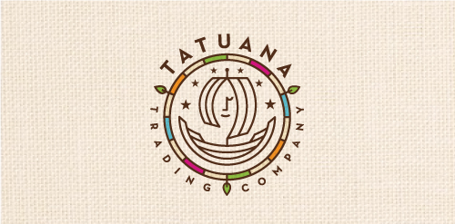
Tatuana Trading Company specializes in honoring tradition, culture, and nature of Guatemala by finding food treasures locally produced by small rural communities including chocolates, coffee alternatives, tea's, spices and other foods. The name comes from a famous legend in Guatemala: Tatuana was a beautiful woman that came to a small town and bewitched everyone. Spanish soldiers, declaring her a witch, put her in jail. When they were going to put her on trial, a soldier came to her jail cell and found it empty. She mysteriously disappeared, leaving behind only one thing: a drawing of a ship on the wall. It is said she climbed in the ship and sailed away. So lives on the legend of Tatuana...

A remake of my shark eSport logo

Logo proposal for a company that builds fire pits (garden fire place). Logo shows a dragon placed in a circular pit and spitting with fire. Logo shown as a primitive like drawing which suggest primal connection with fire and it's importance for people.

A brute strength, style logo for a industrial company.

...
Serbian national hat (Šajkača), faces like hops and mustaches.
SM - monogram

My older logo. It is sold.

Branding for Ponoi (“ПОНОЙ”) River Co (since 1991). - They operate high-end catch-and-release fly-fishing camps on the Kola Peninsula (northern Russia). The fishing is second to none and the river is known as the most prolific Atlantic Salmon river left in the world. Target audience is 55-60 years old.
Logo for a new apparel company named Outlaw
sesibol.com music finder logo http://www.behance.net/gallery/Sesibol/5600099

Health, sport

house wood

mutation concept typo
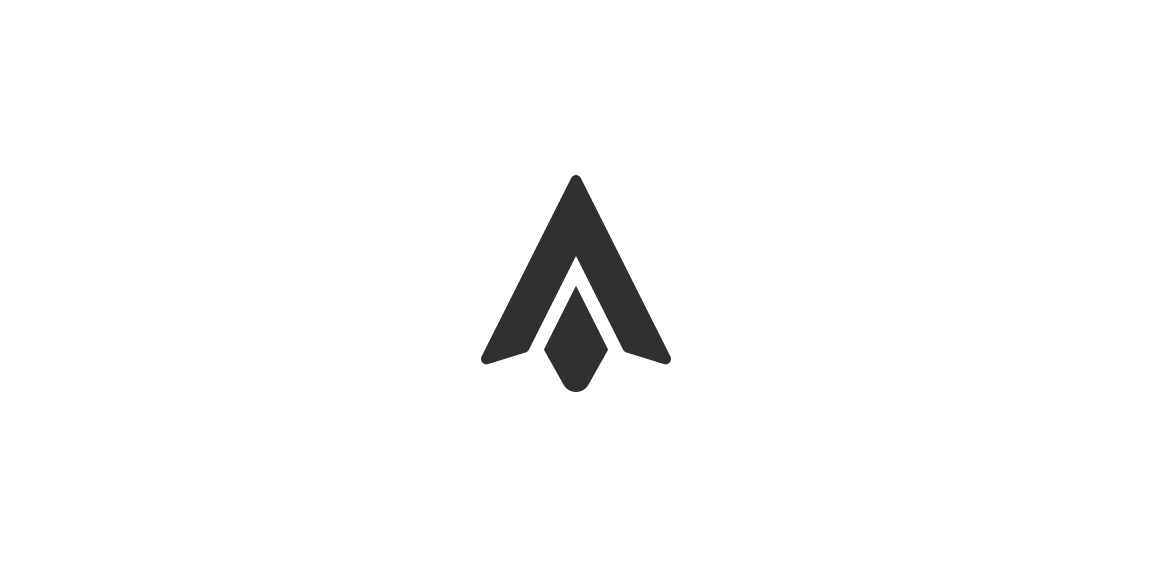
My logo design is based on the structure of the letter 'A' in combination with the form of a flint arrow head. Arrows have a connotation to meet targets which graphic design projects are based upon.
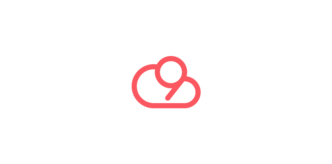
Cloud 9 is presented through combining the form of the number 9 within the cloud structure.

Vesna ambigram

Elite High School
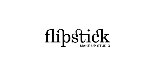
Naming & typographic logo for make-up studio. The idea was to create something connected to fashion and make-up art. So, the name came from F + lipstick. The Fashionable inscription look & the twisted ligatures (just like women twirl their lipstick) make the logo in harmony with the name and communicates the desired message.
Logo Blacksheep