Highest rated logos
Highest rated logos – Page 15
The logo concept of a financial firm that connects companies from the Croatia, Slovenia, Bosnia and Serbia with investors from Western Europe, North America, Asia and the Middle East.


.


Dog and Owl shop logo design. Owl is below the dog.

logo created for a mexican cuisine restaurant based in spain.
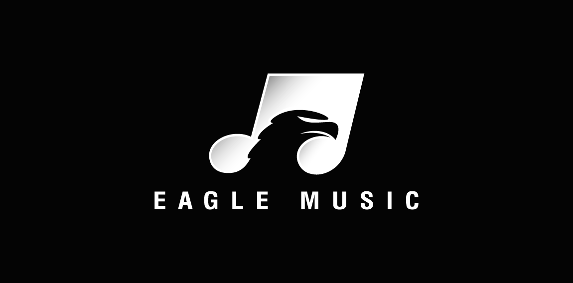
A nice and clever negative space logo featuring a musical note having an Eagle's head placed inside of it as hidden or negative space.
The city of Torcy, France recently built a great complex dedicated to the promotion of Culture & Arts, highlighting local and national artists. I was contacted to work on its complete Brand Identity, including Naming, Logotype, visual identity, Print communication, exterior & interior signage, website design and clothing.
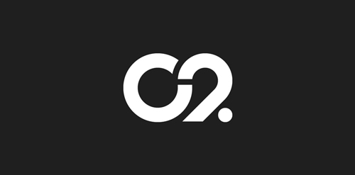
The main goal was to create a total new and innovative identity. Naming took a great part in that sense. I focused on trying to create a simple yet effective name for that building. C2 was chosen from a couple of hundred names for its international recognition, pronunciation and readibility. It stands simply for Cultural Center or the two initials 2xC -> C2.
As far as the logo is concerned, it followed in a logical way the naming process. A will to create a modern and contemporary logotype, yet efficient, minimal, powerful and durable. It was created so it could nicely fit and be readable at a great or tiny size on any document. The logotype guidelines show a slight dipping of the « C » and the « . » to create the optical illusion that all characters are aligned on the same baseline.

logo for a clinical nutrition specialist based in mexico.
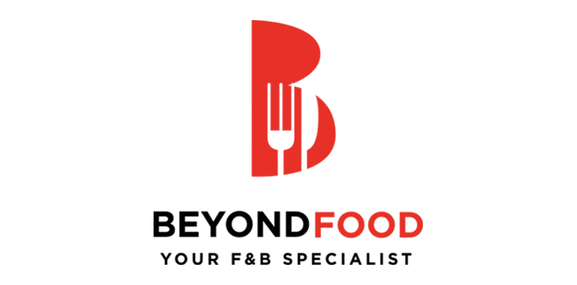
Creatlive studios design logo for Beyond Food
Steven Michael Signature

Logo-mark for a lighting company
Logo redesign for surf/skateboard apparel company.
Cyclops

Huuuge logo search for Taganka Brewery. Full search: https://www.behance.net/portfolio/editor?project_id=63651085

Stefani (hair studio)- logo.
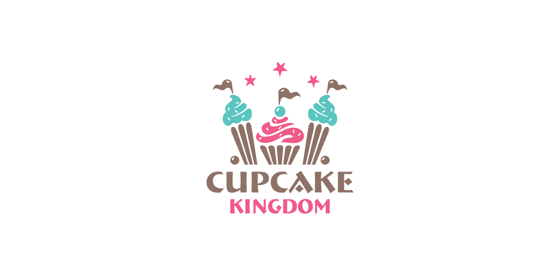
Beautiful and stylized bakery and cake logo design, a cute cupcake with castle towers.
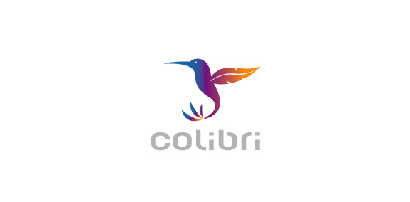
Colibri by Boldflower Design Studio,Contact me:meksikositi@gmail.com
A monogram for a prsonal trainer
Sfera by Boldflower Design Studio Contact me: meksikositi@gmail.com
Logo for the clothing brand https://www.behance.net/WiktorAres
B1 Media- ''negative space'' logo.

Logo for company selling high-end Indian designer clothes within the U.S. to fashion & design-conscious consumers. The idea was to incorporate some strong element that recognizes with India and something that relays to fashion/apparel, so I combined Taj Mahal and hanger.

Original and smart logo. For sale.

New media logo