Highest rated logos
Highest rated logos – Page 140

Logo for spin-out company dedicated to the professional preparation of EU projects. Logo symbolizes letter F and man raising hand.


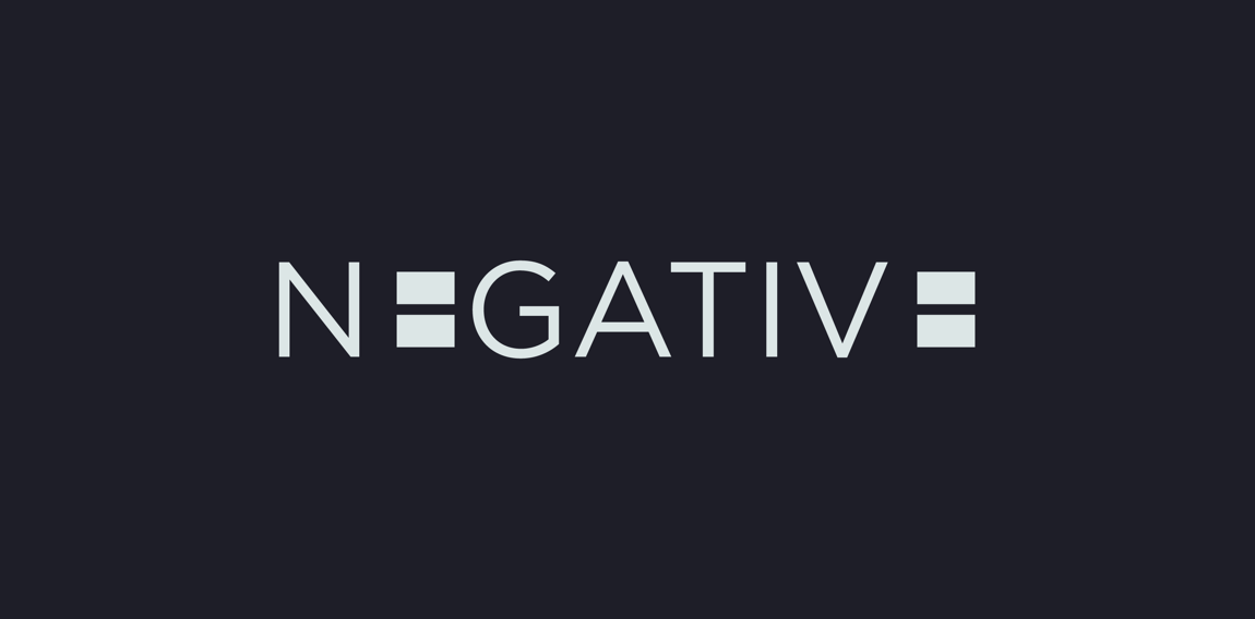
B and C monogram- c is hidden in negative space.

Outdoor equipment service. Reparations of damage to outdoor clothing, changing of zippers and velcro strips, reinforcement of weak areas on ski pants with Kevlar, washing and impregnation of shell jackets, washing of dun jackets and sleeping bags, grinding of skis, resoling of climbing shoes, impregnation of tents, alterations to length on various membrane clothing and service of F-16 fighter jets. Outdoor Equipment is owned by Fleur Pearson who has been a tailor since 1994 and also houses Gore-tex Service Center Denmark.

Another version of Hai Baby Shop logo ("Hai" = "ocean" in Mandarin), but the client was already too happy with the original one and closed the deal so I decided to keep this as our own experimental project. :)

Clinic logo
Musikings logo

Simple, minimalistic and modern logo concept. Lettermark A and fish tail incorporated in subtle way make this concept - memorable, unique and clever.

Logo for free consulting service “St. Petersburg Restaurants Rating” which provides information about Bars, Café, Restaurant etc.

Matson & Ridley Safaris - client work


Logotype design for an American Loyalty Bonus program company, called Earn IQ. Design by Vasilis Magoulas / VAMADESIGN.COM

Ecocity logo


Some experiment about verbicon, i hope you like :)

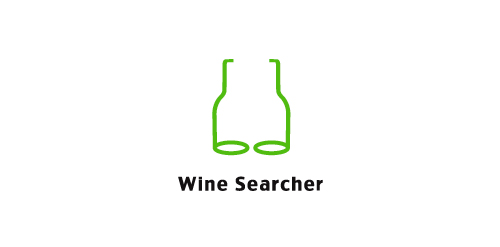
Wine Searcher logo
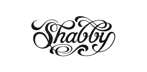
Hand lettered wordmark 'Shabby'. Collaboration with Gert van Duinen (cresk.nl).
Some experiment about verbicon, i hope you like :)

Mining Industry

Logo for a food store business. For sale on BrandCrowd.

advertising agency

Logo design for petrol station