Highest rated logos
Highest rated logos – Page 138

Logo for Tres Amigos Bar


Design studio «Indi». From Indians and, a little bit, form «In Design» )

Logo for a new blog about lettering, typography, calligraphy, process and inspiration www.typedivision.com

Place for little artists, scientist and fun lovers.

Web-shop for girls

Cube - meeting organisation

Logo for the online "valley of tutorials".
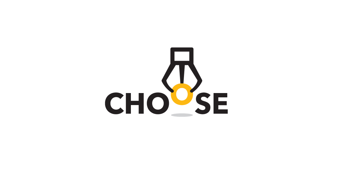
Logo for a game platform that engages people to choose only one of the best products. The idea creates a claw machine picking up the O letter to represent "Choose".

"Vuông in Vietnamese means Square" Vuong was born in 2010, it came from the passion of art and crafts produced by a passionate artist classic definition of paper, leather and fabric. Wishing to transmit classical values combined with modern designs. Vuong developed models with rich materials from papers, leather and fabrics for applications of daily handmade products. 2013, Vuong created its own Fanpage, with a desire to become a place to serve people in a friendlier and more attentive way.

logo for construction company

Unused proposal for an entrepreneurship training program.

Platform brings many talents together to form a solution, this is what makes up Platform - in a nutshell. The branding signifies these talents with multicoloured squares which are brought together to make up the logo and branding. The squares also form a 'platform' shape.
The main logo is ever changing and diverse. The number of squares and the colours are constant, but they rearrange from letterhead to business card to website etc., so it'll always look the same but is dynamic and evolving - just like Platform’s work.

Logo design for a kiosks chain. Designer: Piotr Ploch.
this logo is unused and for sell made by me..
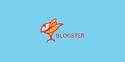
Exclusive Customizable Logo at http://wp.me/s4571j-blogster

Games and applications for social networks.

Ecocity logo


Some experiment about verbicon, i hope you like :)
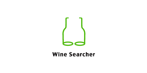
Wine Searcher logo
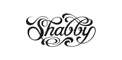
Hand lettered wordmark 'Shabby'. Collaboration with Gert van Duinen (cresk.nl).
Some experiment about verbicon, i hope you like :)
