Highest rated logos
Highest rated logos – Page 125

Marble brick moods of the logo design first proposal concept for Michael D'Onofrio, Inc.


logotype for date portal based on searching partners fitting to quick quiz answers.

Monogram for my friends Artur & Alina The same first letter of their names gave me the idea to create a symmetrical sign.

manufacture and sale of products from magnesium and aluminum

A Dutch web hosting company.

Fishing hook + fish in negative space, nice idea for any kind of business.
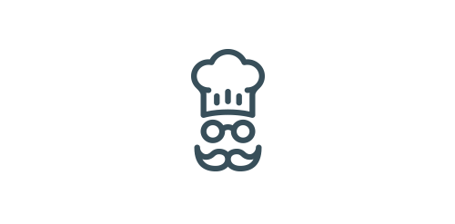
Chef logo for sale http://goo.gl/6pcE7t

doctorio – Internet marketing

.

Pediatric dentistry in Moscow. Russian name is "Мартинка".

Brand identity for Copper Bird Cafe

http://www.neilan.pl http://www.behance.net/neilan
Overview The company – Boutiquette, online boutique selling affordable clothing made from natural high quality fabrics, from up and coming designers. Challenge Developing a memorable, fresh and creative logo for the Boutiquette brand. The logo should relate to the name Boutiquette, which is a combination of words boutique and etiquette. The task was to create a visual identity which would convey edginess, creativity and style.
Graphic Design Studio

Moonbase is a creative entity, primarily working in film and design. It is a versatile company that excels at experimental projects

Logo design proposal for a new Dutch kids wear label.

pet store www.emusklep.pl

Frendi is an online company offering free samples of the goods in exchange for their user reviews. Mark is a combination of gift shape (free samples) and chat form (review) with text line inside (F letter). - - - Made for Motyf Studio - - Live on www.frendi.pl - follow us on www.fb.me/triptic.design
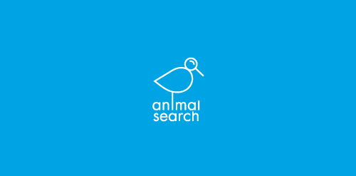
A bird with a magnifying glass for a head representing 'search'.
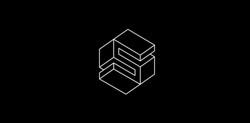
isometric logo S inspiration M. C. Escher

logo concept for film/ad production setup.

construction company

Creative brands In the Arab world