Highest rated logos
Highest rated logos – Page 120

hotel


Poland tastes good. Logo that promotes polish high quality non-processeced agricultural products.
Logo for dog shelter.

Unused Proposal for water services company

The brand name was inspired by its NZ origins, the Maori language and it pure make-up, hence the pura part of the name.
We developed a vibrant mark and bold visual language to share the unique (and exciting) story of Apura. The images evoke the purity of this product and the colour palette was picked from the NZ landscape.

logo created for a revitalized tires company based in mexico.

Cute little elephant. Perfect for science or labs. For sale.

Cinkilinki logo
Play with the lettering. :)

Signature - logo for felt artist.

Contemporary design for online publication. With custom-made wordmark and clever use of negative space, this logo is unique and modern with touch of vintage art deco/art noveau look.

Safari logo design

Melt water production.
Ideal logo design for data storage device and cloud storage service.

travel company
A logo is simple and straightforward. A letter S formed by a snake that turns on itself. Inspired by the famous game. Easily reproducible and recognizable.
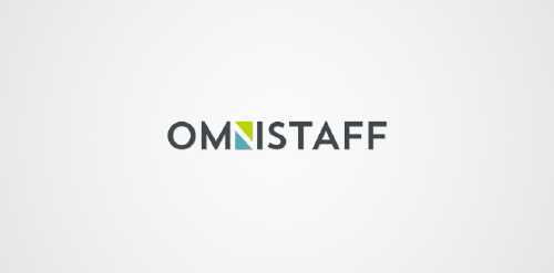
This was a commission we received from a company called Omnistaff - A recruitment Agency based in Johannesburg, South Africa. The company required a minimal logo that signified the multilateral approach they had to staffing solutions. This logo makes use of clever negative space to create the N, which just so happens to look like two arrows pointing in different directions.

'Higher Grounds' is coffee shop in Cloudcroft (New Mexico) situated 9000ft above the sea level with cool hills.. It's a kinda tourist spot.. So that's where this logo came from.. My idea is to show the place (Cloudcroft) with mountains and to take it over the coffee in a single line drawing.. And few colors added to make it more scenic by having the business on the core of the logo.. so it's kinda 50% for the business and 50% for the place..

Minternet, is the Web Design and Development company from Mike Munro. The logo has been designed to represent communication and collaboration between developer and client to create a diamond product. Within the negative space, directional arrows split to represent web development.
Some experiment about verbicon, i hope you like :)

Mud Gear

Logo/emblem for Emmu Bottom Homestead Anzac Buiscits, located in Australia.

Location pin + compass. Mark for a information based system for a visited geographic locations
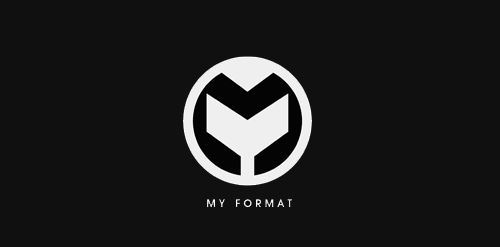
My format. Music club