Highest rated logos
Highest rated logos – Page 117
Poland tastes good. Logo that promotes polish high quality non-processeced agricultural products.


Unused Proposal for water services company

Logo design proposal for a new Dutch kids wear label.

pet store www.emusklep.pl

The brand name was inspired by its NZ origins, the Maori language and it pure make-up, hence the pura part of the name.
We developed a vibrant mark and bold visual language to share the unique (and exciting) story of Apura. The images evoke the purity of this product and the colour palette was picked from the NZ landscape.
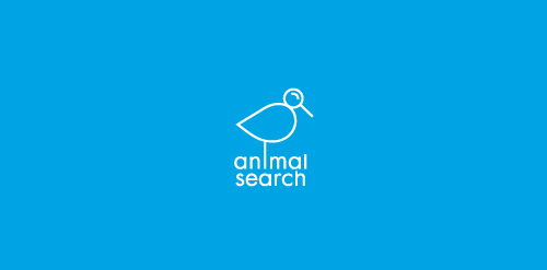
A bird with a magnifying glass for a head representing 'search'.

logo created for a revitalized tires company based in mexico.

Cute little elephant. Perfect for science or labs. For sale.

logo concept for film/ad production setup.

construction company

New streetwear company

hotel

R.S.B.C mean "Robert Smolarek Business Consulting" - unfortunately client changed name for "Fog City" and choose other design - you can check it here www.fogcity.com.pl

This is a crest I'm working on for my two brothers that are going to be my best men in my wedding. I plan on using it to put on a pint glass or beer mug. The year in the middle will represent the year that they were born.

This is sign for woman-copywriter, who write texts at aristokratic style
Play with the lettering. :)

HELLHOUND is fresh modern dynamic brand with short easy memorable name. It will suite well to any business or industry.

This is the logo of a Interactive Agency that develops fresh work in Lima, Perú. The color and the well designed logo it is a combination of what this award Agency wanted to portra,y its desire for innovation and professionalism at the same time.

Contemporary design for online publication. With custom-made wordmark and clever use of negative space, this logo is unique and modern with touch of vintage art deco/art noveau look.
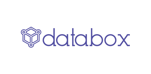
Ideal logo design for data storage device and cloud storage service.
spicy restaurant
KM
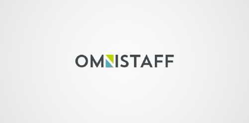
This was a commission we received from a company called Omnistaff - A recruitment Agency based in Johannesburg, South Africa. The company required a minimal logo that signified the multilateral approach they had to staffing solutions. This logo makes use of clever negative space to create the N, which just so happens to look like two arrows pointing in different directions.

Light household structures.