Highest rated logos
Highest rated logos – Page 11
I decided to challenge myself to create logotypes everyday with random words.


York

I decided to challenge myself to create logotypes everyday with random words.

Studio keramike Ines Janjić (Pottery studio Ines Janjić)- logo.
logo snowflake cosmetic

...
I started a small graphic tshirt and poster print company. Launching this September...hopefully.

Logo for trade company.
Sequioa

logo for a multidisciplinary creative firm.
Icon made of an ice cream cone and a mouse hand cursor (click)

Health Insurance Company
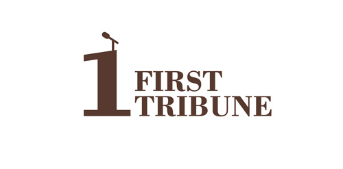
Logo for news papers.


Logo for marine port


A logo made from letters. A couple of cute bunnies in love.

Sidd & Laine’s mission is to help the world shine a little brighter with jewellery and accessories that look great and make people feel fantastic. The collection consists of jewellery that is lovingly hand-made by artisans in northern India. Designed using natural, semi-precious stones, the range compliments styles as varied as boho-chic, the oh-so glam socialite or even the jeans and T-shirt kind of gal. We were thrilled when we were commissioned to design Sidd & Laine’s brand identity. Aiming to attract a fashionable female audience, the new logo incorporates a geometric shape based on authentic Indian patterns. Serif typography, a vibrant colour palette and luxurious print finishing, like gold foil, were used to combine an elegant and exclusive personality.

https://www.behance.net/gallery/16906829/Teaura This brand has a strategic objective to represent and communicate through a set of visual signs, quality, simplicity and modernity; predominant modulation of their strokes and endings. Tea Leaf: The leaf or bud tea plant is essential to our identity, which is a more representative and traditional element. Source: strokes and terminations Chinese signs were taken into account to make the brand Tèaura as the Tea originally comes from China.

Privè Club's Logo

logo for night club
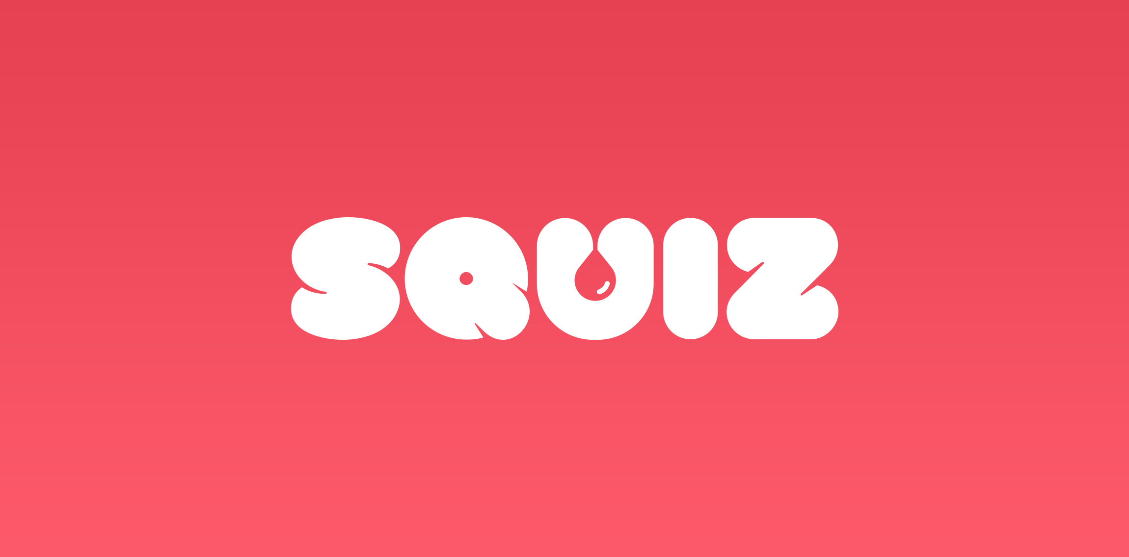
Logo design and name for quiz app.
Check out full project on my portfolio:
http://vhs-kid.com/project/squiz/
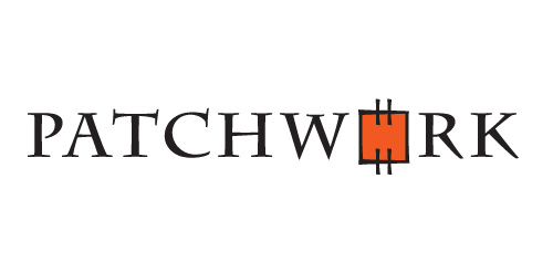
PATCHWORK is a logo that represents the art of making great designs from basic shapes pieced together so that 1+1>2. It has the perfect eye-catcher - a colourful "patch" combined with a typeface that looks as if sewn. These match to create a strong and memorable logo.

Sound System's Logo